The who
Telstra.
Telstra is Australia’s largest Telecommunications company.
My role
Visual Designer
Tools
Figma, Sketch
Stakeholders
Design System Teams (Able and TEDUI)
Project PO’s/UI-UX Designers
Accessibility SMEs
Please note:
When I started at Telstra we were using Sketch (for UI Design), Miro (for Design Critique boards) and Axure (for UX wires/prototyping). During my time, Telstra switched from Sketch and Axure to Figma, and from Miro to Atlassian Whiteboards. So, majority of the initial UX designs and my initial UI exploration designs were created in now decommissioned tools, hence, I have limited visual examples of early exploration iterations.
The request
The project I worked on at Telstra is called - Adaptive Networks Centre (ANC). It’s a brand new platform for Enterprise customers, partners and sellers to create their whole network of sites and services in one digital platform.
Telstra has a main Design System, called Able, and supplementary design systems for Enterprise use cases, such as Telstra Enterprise UI (TEDUI). During my time working on ANC the pages and flows that I designed for required new components to be created that were not already available in Able or TEDUI.
The following are some examples of the components I worked on uplifting or creating from scratch that were folded into both Design Systems for all other designs in the organisation to consume.
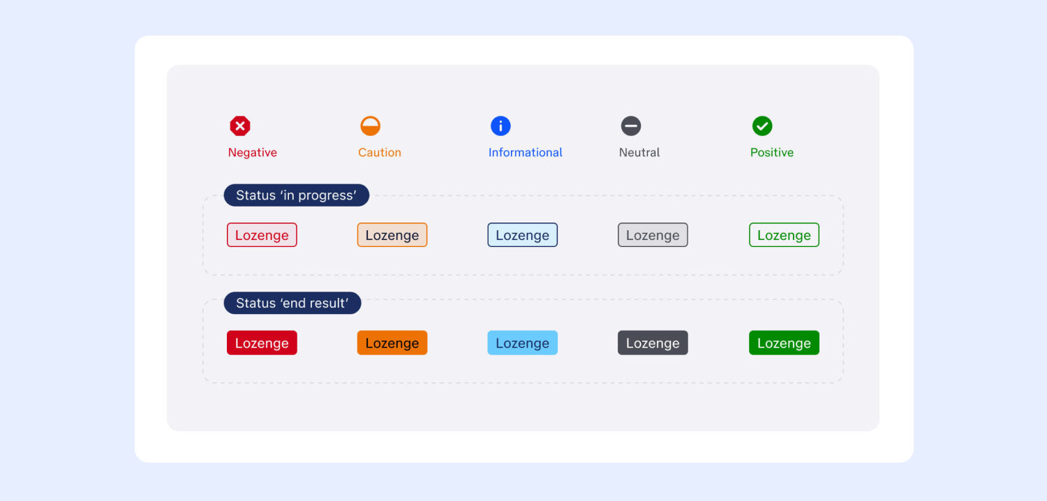
Component Uplift: New colours for Lozenges
Able already had Lozenge components, however, the colour choices available were limited.

ANC had requirements for about 25 statuses over the lifetime of the service ordering process and service usage, so we needed to introduce new colours for new status types that were being introduced.

The process (and challenges)
Looking at what colours were available to use in the Telstra colour palette.
Exploring different colour combinations, ensuring they pass WCAG colour contrast guidelines.
Working within the Able pattern guidelines - lighter colour with keyline stroke for when a status is essentially in a various stage of progress, through to solid-infill when the status is at the end/completion of its cycle.
Presenting various options/colour combinations in project Design Critique sessions (with project POs and project designers), as well as wider design team critique sessions for feedback from others outside the project, along with gaining approvals from the Accessibility SMEs.
Presenting options back to the Able team to ensure for feedback and final approval.
ANC developers then collaborated with Able to build the new colours in code.
The outcome
The new coloured lozenges were were officially added to the Able library for all Telstra Designers to consume. Met with much enthusiasm from other designers who were also constrained with the orignal limited colour offerings.
New component creation for an order tracking timeline
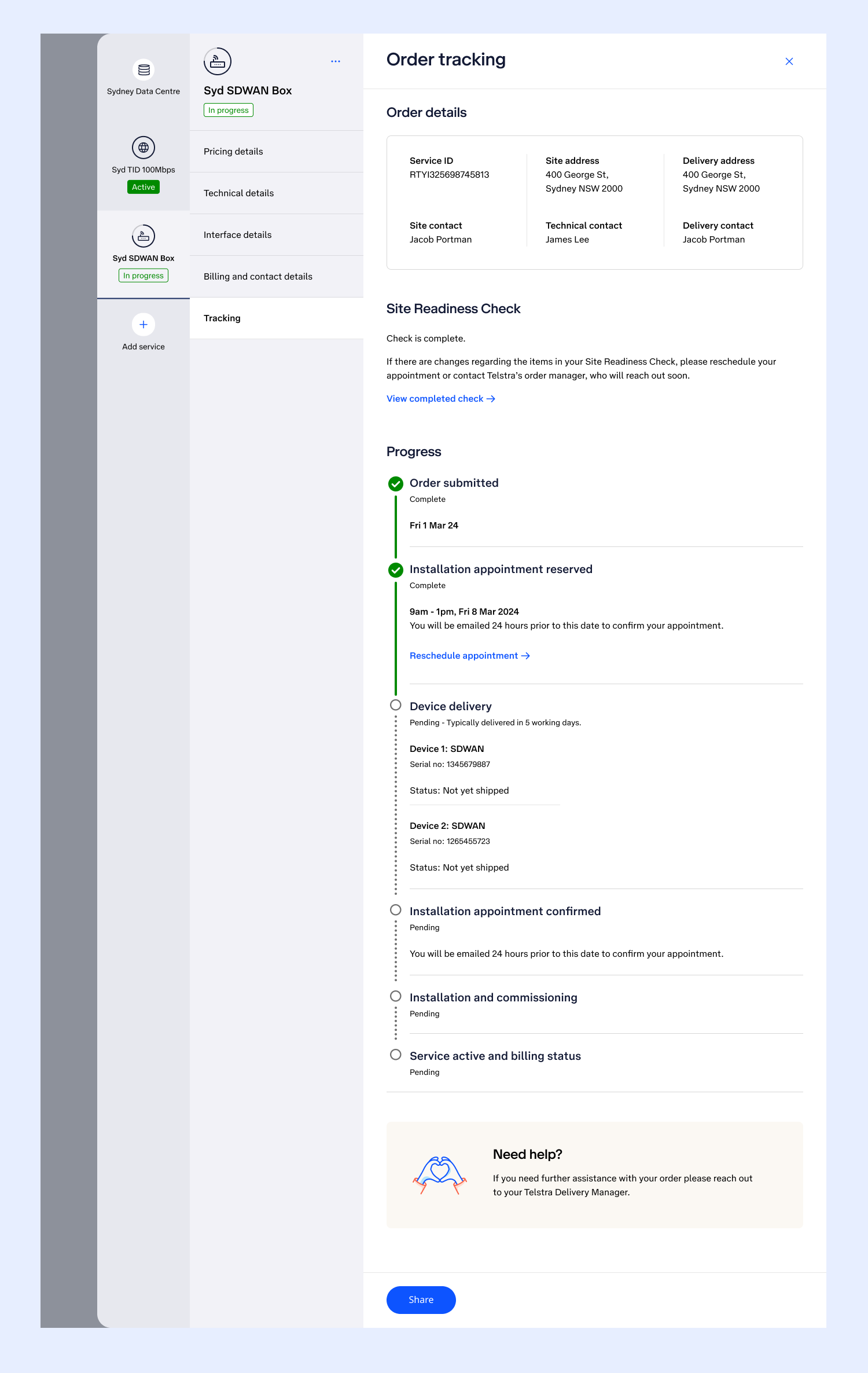
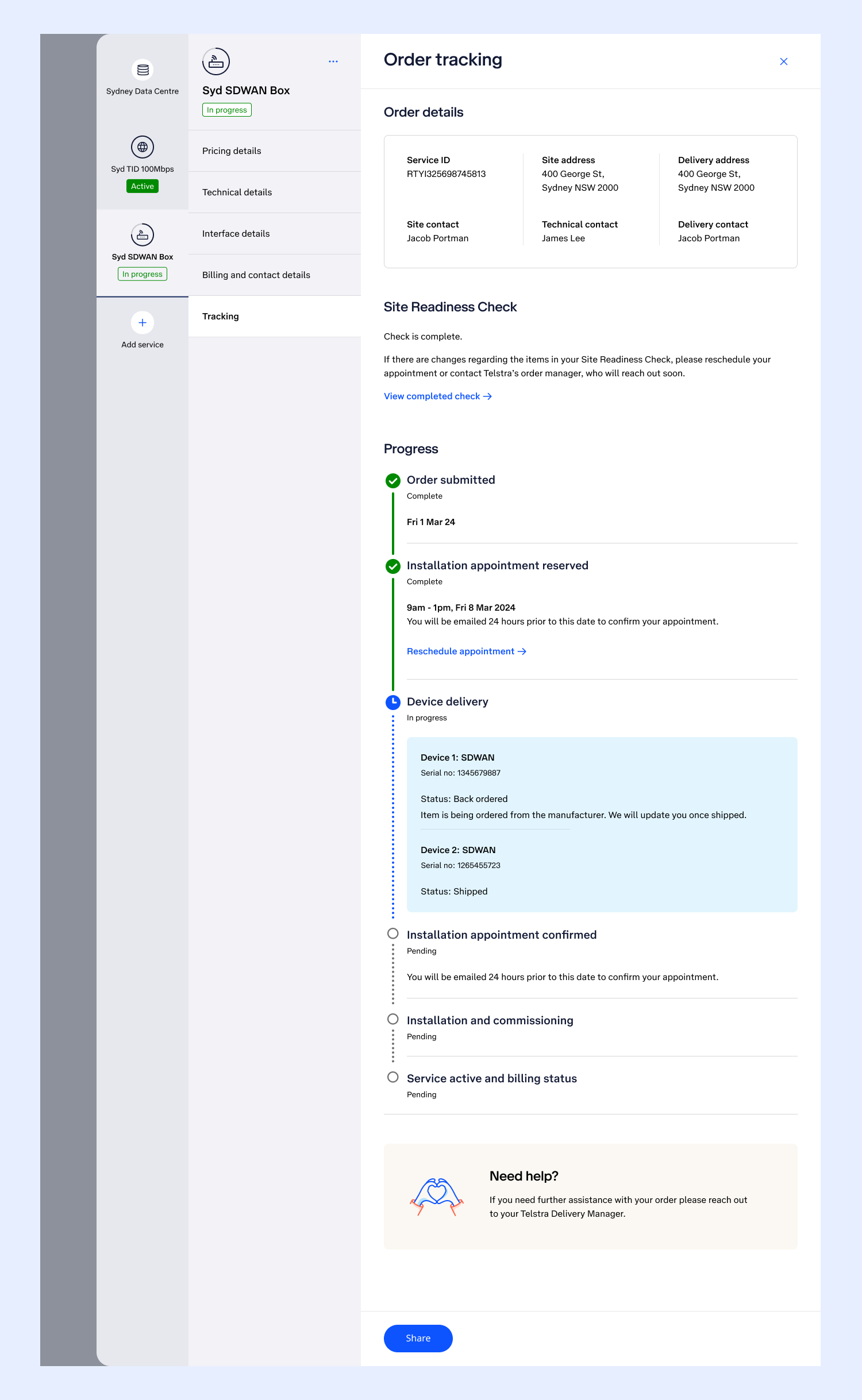
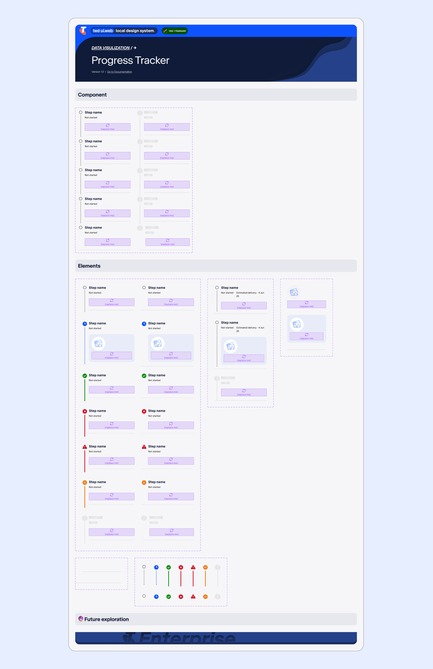
One of the ANC pages I designed was an Order Tracker page for users to track the steps in their orders from initial placement right through to final installation. At the time, there were no timeline/tracking components available in Able or TEDUI.
Also at the time, another designer in another mission had a need for a tracker/timeline component, so there was a wider appetite beyond the project to introduce this component.
The process (and challenges)
Asking the wider Telstra design community if anyone had worked on a timeline, to see if there were any initial designs to align to.
UI exploration, such as:
Choosing appropriate icons for each timeline status.
Exploring options for use of lozenge in the status vs just text (considering ANC is already Lozenge heavy).
Exploring each steps side line options - solid vs dotted, size and colour (ensuring WCAG colour contrast).
Presenting various options in numerous Design Critiques for feedback.
Consulting Accessibility SMEs for advise on heading tags and most appropriate flow of information.
Navigating the challenge that sometimes the timeline can be non-linear.
Ensuring the current in-progress status stands out the most to allow users to understand where the most current step in the timeline.
The outcome
Working with the Enterprise Design Lead we created official componentry for the Order Tracker in the TEDUI library. Using variables to switch between status icons and lines and adding loading states. We decided to use “replace me boxes” in each step (this is before Figma introduced slots), so that designers consuming the component could add any step content they needed, this made the component as flexible as possible.
The component is now available for Telstra designers to consume.
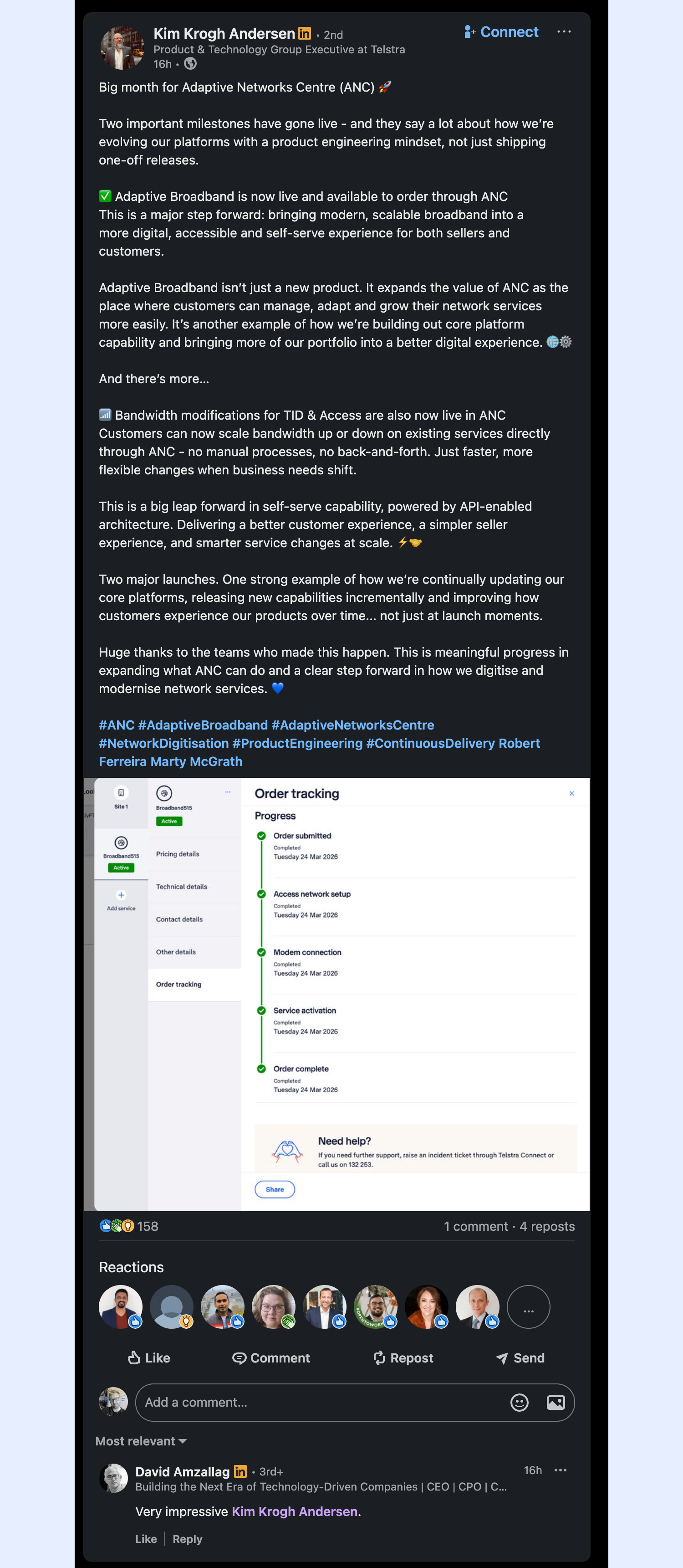
Always a joy to open up LinkedIn and see images of my designs, this time in a post about ANC from the Product & Technology Group Executive at Telstra: