The who
Greater Western Water (GWW)
A government-owned water utility in Melbourne, Victoria (formed in July 2021 from the integration of City West Water (CWW) and Western Water (WW)).
Project Team
Myself (UI/UX)
Senior UX Designer
IT/Devs/BAs/Testers
Brand/Marketing/Content
ELT
The what
The GWW Design System was established by designing GWW’s new enterprise website.
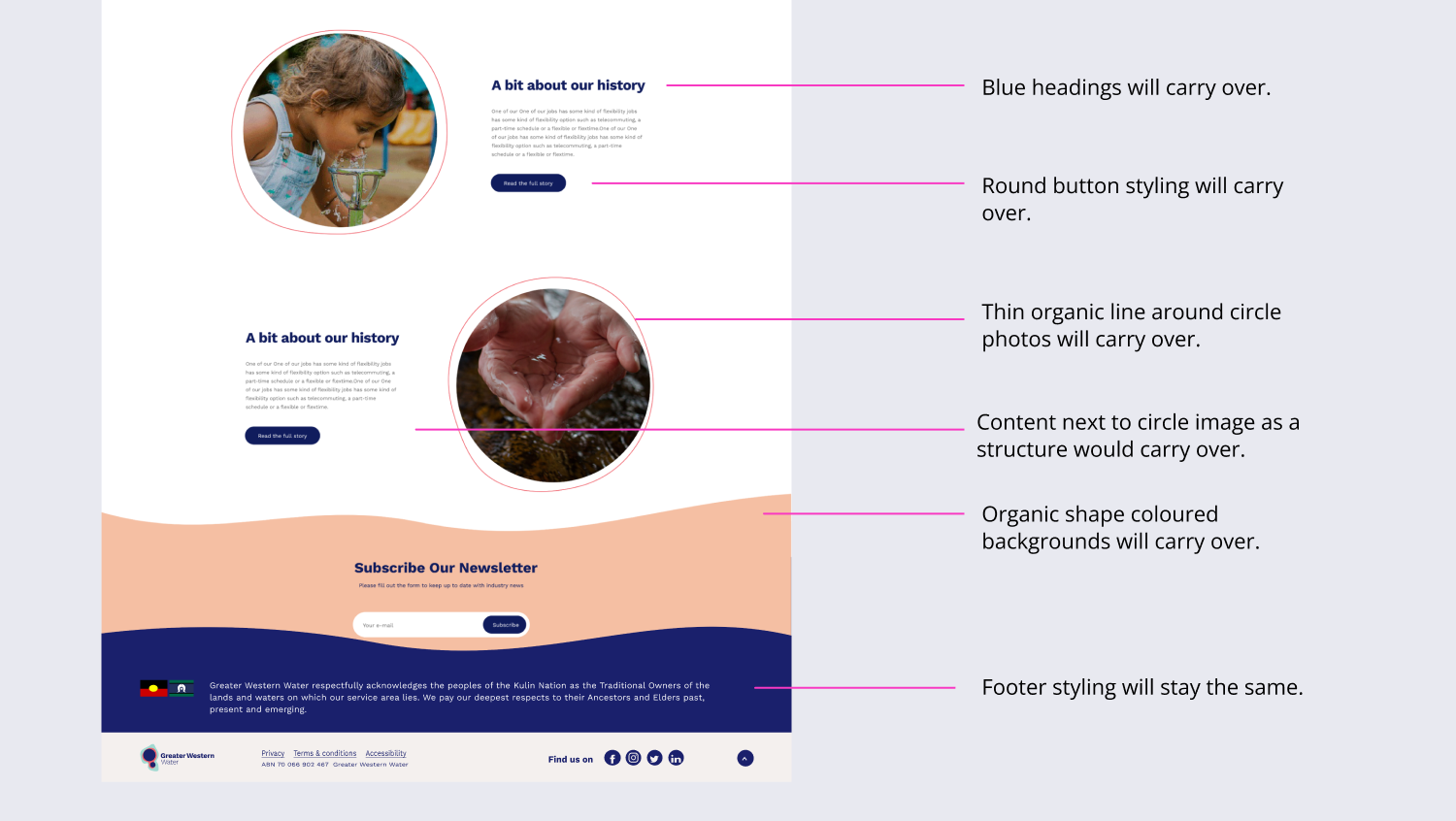
The existing microsite had established some branded elements that were requested to be carried through into the new larger enterprise site (eg, website footer, icons styles, button styles organic shape background blocks image treatments).
However, as the microsite was not a fully-fledged website, the new GWW website required components that didn’t exist yet and needed to be created from scratch.
These newly designed components would start forming GWW’s first-ever design system.
GWW Design System components
Typography
Typography style sheets were created for desktop and mobile.
Buttons
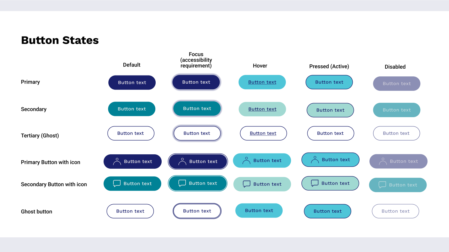
The button shape styling carried over from the microsite, but hover, pressed (active) and focus states were updated or introduced if they previously didn’t exist.
Colours
GWW brand colours were already established in the style guide from the integration re-branding (created by an external agency - Fuel). However, for stronger digital accessibility, I introduced accessible error-red, success-green and alert-amber. These new choices help meet our target for compliance with WCAG 2.1 AA (the standard rating that Victorian Government entities are required to meet).
New functional Icons
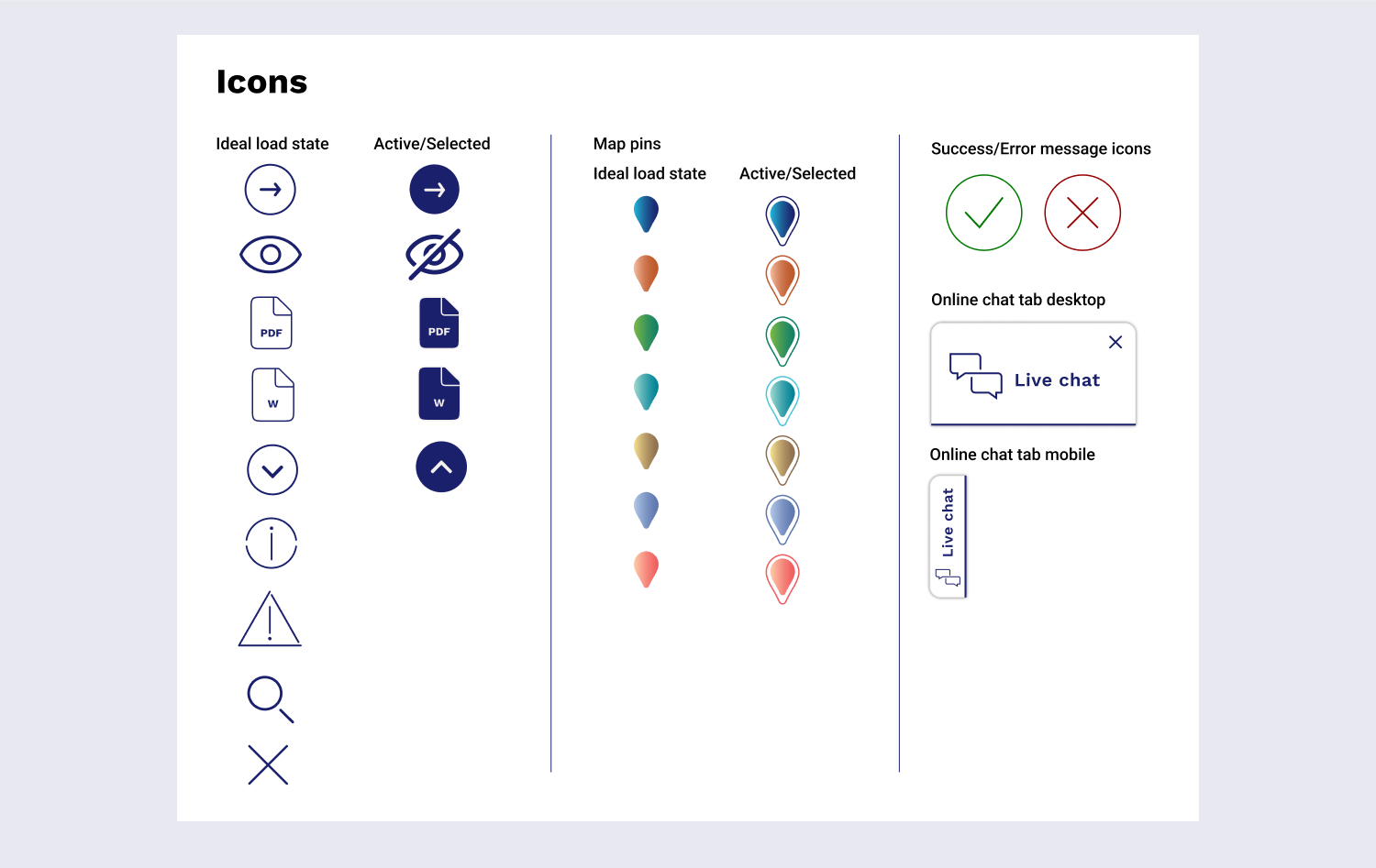
The microsite had no functional icons (other than decorative icons developed by Fuel). New functional icons, updated map pins, and live chat tabs were created.
New campaign tabs for the homepage
At the top of City West Water's legacy homepage, there was a full-width carousel with space for 5 campaigns. The Brand team were attached to this feature and requested it in the new GWW website.
I advised that carousels are generally not accessible (eg, issues with movement, and text in images as opposed to readable HTML over the top etc), so I introduced an alternative - a tabbable tile block. An accessible and segmented way to more than double the marketing space for campaign messages, now offering a total of 12 campaign tiles for different segmentations (residential, business, builders and plumbers and developer customers). Also, with this feature users can choose to see information that is only relevant to them (as opposed to seeing all the carousel slides).
Introducing tiles to the suite
The Brand team wanted to replicate most components from the microsite (designed by an external provider - Bliss Media). I highlighted the design flaws with some of these components. For example, free-floating blocks in the microsite created inconsistent button alignment which tends to look messy or like an error. I introduced structured tiles within soft curved edges and simple icons for consistent structure/alignment and reduced cognitive load for the user.
The tile theme continued into creating quick-link tiles.
City West Water's legacy website was notorious for crowded navigation on the homepage, overwhelming users. In the new homepage design, we stripped away multiple and conflicting CTA’s and introduced one super navigation tile group at the top of the homepage lining to the top self-service tasks. The helps users get to their destinations easier and quicker.
These tile styles were also applied in page templates at the bottom of the page for “quick-link” options.
Changing page header banners
A request from the Brand team was to carry over the microsite header as it was into the new site.
Whilst the layout is fine (blue on the right to contrast against a white H1, brand shape in the middle, and image on the left), I advocated for a banner uplift.
As a design choice I wanted each section in the website (eg “Accounts and billing”, “Faults and works” etc), to have its own identity. So each section uses its own brand shape and colour. This helps users have a sense of where they are on the site. When the banner shape and colour change, users can identify that they’re in a different section of the site. Desktop and responsive mobile banners were supplied.
The following are other components I created to use in page templates:
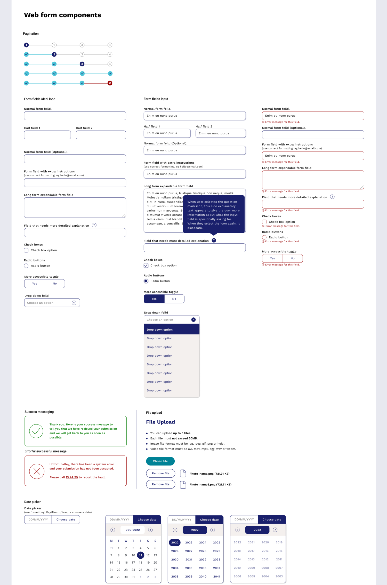
Web form components
Content page components
Main menu for desktop and mobile
CTA’s and info/emergency banners
Image treatment and video blocks
The outcome
These Design System components were used to create page templates for the whole website.
The Design System as a project is in its early phases at GWW. The next step will be to add these components to a GitHub repository so that changes made from designs can be pushed to GitHub, ensuring that any team working on producing digital assets is using the latest/accessible/approved components.
Move to the next case study to see the Design System used to design GWW’s first enterprise website.


