The who
Greater Western Water (GWW)
A government-owned water utility in Melbourne, Victoria (formed in July 2021 from the integration of City West Water (CWW) and Western Water (WW)).
My role
UI/UX Designer
Team
Myself (UI/UX)
Senior UX Designer
IT/Devs/BAs/Testers
Brand/Marketing/Content
ELT
The problem
When GWW first formed in July 2021(the integration of City West Water (CWW) and Western Water (WW)) it had 3 customer-facing digital environments:
a legacy website for City West Water (CWW)
a legacy website for Western Water (WW)
a new microsite for GWW
The solution
GWW needed a single fully-functional enterprise website that would supersede and replace all existing environments.
The process
Initial designs and challenges
To solidify the overall look and feel of GWW’s first consolidated website, I wanted to focus on the homepage first, as components and styling on this page would influence the rest of the site.
The external agency that tested our new IA structure (ICON Agency) also provided basic wireframe mockups.
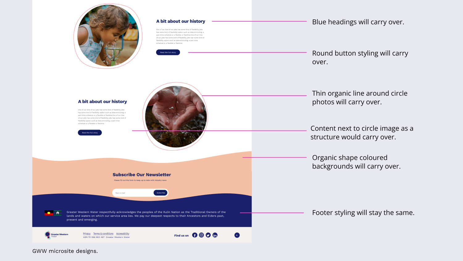
GWW had existing styling on the microsite (designed by Bliss Media) that was already establishing a digital identity. Some of these elements were requested to be carried over into the new consolidated website.
To get started, I had some basic wires, and some existing microsite styling to replicate. However, there were a few challenges:
The supplied wireframes weren’t finalised (eg, page requirements weren’t decided on and reflected in the wires). They weren’t a locked-in/approved roadmap for UI. They were indicative of possibility only. This meant that when I was designing in mid-fidelity I was also essentially wireframing structure and introducing elements because those decisions hadn’t been finalised yet.
Some of the components from the microsite that Brand requested to carry over had design flaws that needed correcting. I was often making a case to the Brand team for why the microsite component needed to be re-designed/uplifted. You can see these key design decisions in more detail in the Design System case study.
GWW was a new brand, only one-year-old when this project started. When I was presenting new components that page templates needed I would hear from the Brand team “But GWW doesn’t have tiles”, so I would often be making a case that we didn’t have them before because the microsite didn’t have that functionality and that this new consolidated site so it needed new styling to suit the new functionality.
Receiving and using feedback for iterations
I would submit a design to the Brand team, receive feedback and fold in that feedback for the next iteration. As well as using my own design sensibility to refine my own work as we progressed.
After the second round of designs, the original external agency that created the GWW brand (Fuel) weighed in from a brand directive and the third round of designs started to take shape and reflect the final designs.
Final homepage designs desktop and mobile
Designing page templates
I provided high-fidelity desktop and mobile designs for the following website page templates:
Home page (+ drop-down menu and alert banners)
Parent/landing page
Content/child page
Search page
News parent page
News article page
Online forms
Outage map (WW legacy customer’s map)
404 error
Validator/Router screens
Pay a Bill payment application (Azure)
I delivered templates in the following states:
Blank/loading
Ideal load
Active/Pressed/Input
Error.
As the templates took shape with new components, a Design System was essentially being created at the same time. GWW didn’t have a Design System prior to this project so my component designs for the consolidated website established the first-ever GWW Design System.
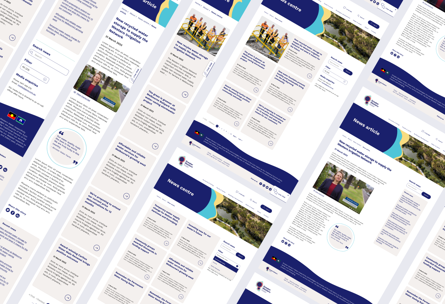
Here are some examples of final page designs for desktop and mobile.
Outage map
Parent/Landing page
News landing and article page
Testing and raising bugs
Once our external developers (ICON Agency) had built a template in the CMS, the Senior UX Designer and I would test and raise any bugs using Bugherd. Towards the end of this project, I was testing and approved updates by myself (as the UX Designer left the organisation before the project was complete).
The project team would meet regularly with the developers to discuss and troubleshoot bugs. We leaned into their accessibility expertise and design compromises and changes were made sometimes to ensure accessibility compliance.
UI Designs for key site features
In addition to designing all website components and page templates, there were two major site features that needed designing for go-live.
The router
The “Pay a bill” online payment app
Let’s take a look at these in more detail.
1. The Router
Buckle up, cause this one needs a little technical explanation.
GWW is the integration of two existing water companies (CWW and WW) each with its own back-end processes and billing systems. This means until all back-end processes/systems are consolidated, information and services are different for customers depending on their legacy service area (CWW area or WW area).
For the website user the new consolidated website experience looks like this:
The user enters the GWW website (hosted on GovCMS/Drupal).
The user selects a specific task or selects a link to find some information - they leave GovCMS and enter into an Azure environment (The Router).
In The Router the user enters their suburb, and they leave the Azure app to enter back into GovCMS on a page specific to their suburb location (eg a page for CWW or WW legacy customers).
Make sense? Still with me? Maybe this little diagram will help:
The aim is for this experience is for it to be seamless as possible for the user. Unless they are paying attention to the changing URLs, the user-facing page styling should remain consistent as they go in-and-out of environments from GovCMS to Azure and back again.
The Senior UX Designer designed the high-level journey flow with the Devs team and provided me with wireframes for the router screens.
A conscious design decision for the router screens was to use the off-white brand colour for the background. By using a background colour I aimed to help inform users that whilst this is still the GWW website (as the header and menu still appear), they have landed on is slightly different page to a normal content page. It helps distinguish this as a task-based page compared to a normal information page with a white background.
Final UI for Azure Router screens.
The Azure application requires up to 5 seconds for the suburb selection (using google maps) to “ping” the back-end of GovCMS to find the right page to send the user to. So we designed a loading screen with a moving loader and seconds that countdown. This loader:
helps the user understand that the system is “thinking” or “doing”
helps the user understand how much time they can expect the loading to take
gives the user an opportunity to cancel this request and “change location” to enter back into the router to enter another suburb if they wish.
The final layer of complexity for this routing experience is suburbs on the border of CWW/WW service areas or new land developments not yet input into google maps. For these situations the router drills down further into an interactive map where users are asked to visually drop a pin on the map to indicate roughly the location of their property.
I provided desktop and mobile final high-fidelity mockups.
2. “Pay a bill” Azure application
The online “Pay a bill” application/form on the previous City West Water website was one of the highest visited pages. It’s the easiest way for customers to pay their bills using a credit card. This application was a requirement for go-live so online payments would be uninterrupted.
Whilst updating the styling of the page/form to look like the new GWW website environment, this was also an opportunity to uplift the form flow/experience.
I had previously worked on an uplift to CWW’s direct debit experience by designing an online direct debit set-up form. Whilst that form didn’t see the light of day (due to the integration) the Senior UX Designer wanted to include my feature idea from that form in the new GWW pay-a-bill form. The feature allows users to edit their inputs on a summary page, rather than track back through the form pages to make any edits.
The Senior UX Designer supplied me with wireframes for the new pay-a-bill form.
I supplied high-fidelity designs using components from the new GWW Design System to ensure the this Azure application had the same look and feel for the rest of the website.
I supplied error state designs:
Mobile designs were also supplied:
The outcome
GWW’s new website went live in December 2022 - www.gww.com.au.
The GWW microsite had a customer satisfaction rating of 2.81 out of 5 (VWO survey results). The same VWO survey was set up on the new consolidated website and is sitting at an increased 3.06 out of 5. We anticipate this will improve over time as user confidence in the new website grows. Some factors contributing to the current score may be:
The previous three digital environments before the new single website will have confused some users and deterred them from returning online.
The routing experience may frustrate some users as it slows them down, so as more and more back-end consolidation occurs the router will eventually be decommissioned.
We engaged external accessibility specialists TTC Global to audit the new website against WCAG 2.1 AA compliance and it garnered a 75% pass rate with any outstanding issues placed on the backlog for refinement after go-live. See the next case study to hear more about how I have been leading accessibility at GWW.


