The who
The Chanel Operations team in
Telstra.
Telstra is Australia’s largest Telecommunications company.
My role
Visual/Graphic Designer
Tools
Illustrator
The request
Telstra hold a yearly exhibition called “Frontline” for their frontline teams and external partners (Google, Samsung etc).
The Chanel Operations (CHOPS) team are entering “A new era” in 2024 and they wanted to showcase their plans for their future (and new era) within Telstra. The CHOPS team had a mammoth 9-booth area (the largest stand at Frontline).
Their ask - design booth artwork and signage for 9 exhibition booth areas.
This was a collaborative design effort with another amazing designer, Ali Banan. With a total of 9 stands, plus additional collateral, we split the work and Ali designed 5 booth walls, and I designed and provided the following:
4 x Booth wall artworks
2 x Stand side panels
2 x Stand top signs
2 x CHOPS team logos
2 x Merchandise table covers
1 x Selfie cut-out card
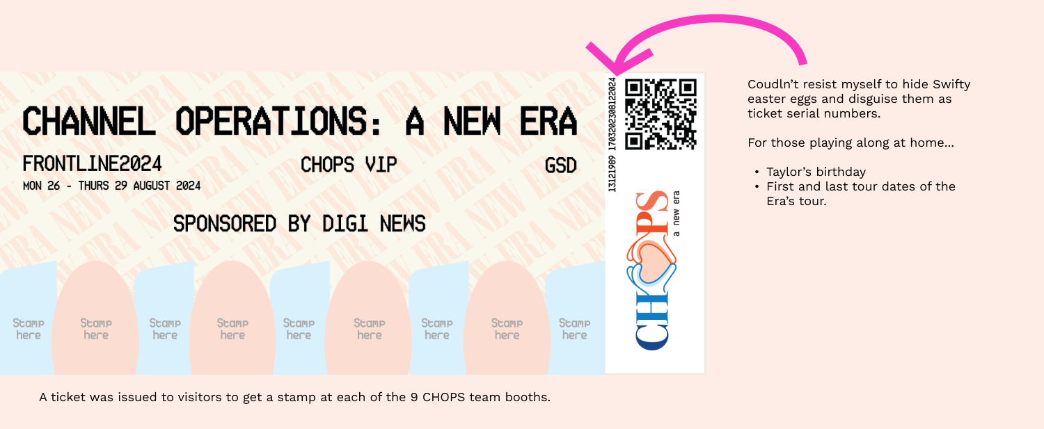
1 x Booth ticket artwork.
The brief
Honest-to-Zeus-truth… this was the brief:
“Taylor Swift Era’s tour”
“Whimsical”
Not the first things that springs to mind when you think of Telstra.
Challenge accepted.
The CHOPS team provided us with a mock up of their own concept for the booth walls. They wanted pastel colours reflective of the Taylor Swift Era’s tour branding, and some form of image on the wall that reflected the team.
Challenges
Colours
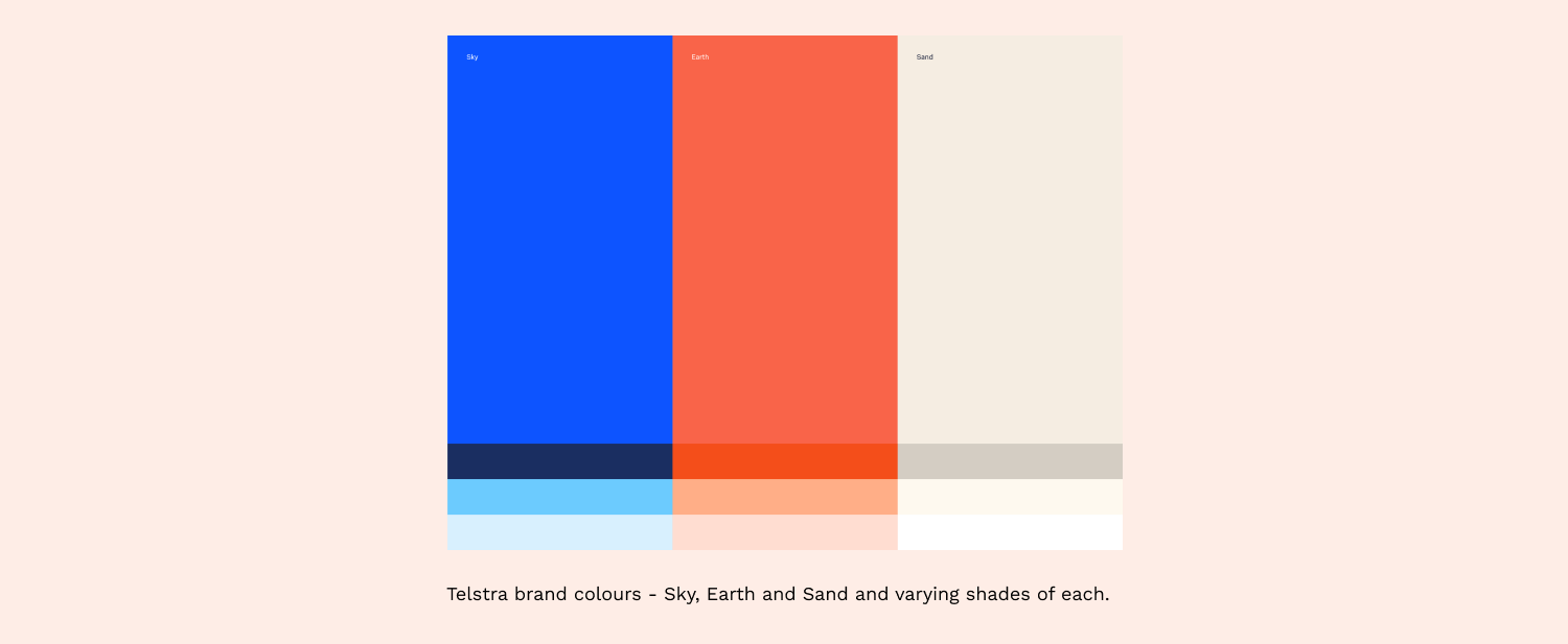
Ali and I knew that we would have to use Telstra brand colours instead of the pastel palette that the team were hoping for. Brand confirmed, yes, we need to adhere to brand colours.
Creating booth wall artwork that compliments, not competes
We knew the booth walls needed to compliment the team members standing in front of them. So we had to factor the following into our designs:
Not be too busy (not compete with items in-front of the booth walls - team members, tables and chairs etc).
Not too much colour (the original team idea was each booth was a different colour, but we knew straight away this would add to the whole area looking overwhelming and busy).
Allow space for a floor cabinet (to house team paperwork and equipment).
Allow space for a TV (all booths ended up requesting a TV to display digital content).
Finding our Swift-spiration
When I was researching “Taylor Swift Era’s Tour” I was instantly struck by one of the poster designs and the colour-blocks coming from the top and bottom of the poster. Taking inspiration from this poster (to align to the initial “Era’s Tour” brief) I proposed that maybe our wall artwork included a colour-block with an illustration on top. And, what if, to help keep it “Telstra”, those colour block shapes were actually shapes taken from the Telstra Logo?
Telstra’s existing illustration style is simple outlines with shading. In order to help keep it looking “Telstra”, I proposed we use this style for the wall artwork illustrations for brand consistency:
Initial concept
I mocked up my idea (Era’s-Tour-like colour-block and an outline illustration) and proposed them to Ali and the CHOPS team:
This idea was unanimously voted for. Ali and I divided the work (he designed 5 booth walls, I designed 4 plus the other additional collateral). We worked very collaboratively throughout the design process, offering each other feedback and suggestions on each others artworks, to help strengthen the final outcome.
Iterations
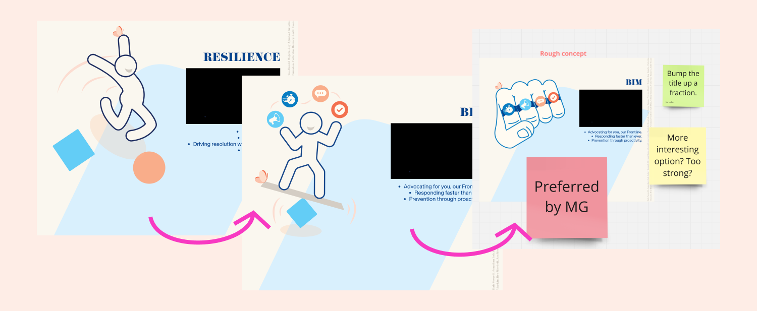
For the individual wall illustrations we asked each team to give us an idea of what motif/image best represented their team. Sometimes the motifs went through various iterations to land on one that the team felt was truly right for them. We used Miro to collaborate and have the team provide feedback on our designs.
The lighter shades in the Telstra colour palette did allow us to still use brand colours, while offering a “Whimsical/Pastel” feel to the artwork (helping to meet the initial brief).
In case this was too much of a departure from standard branding usually associated with Telstra, Ali and I presented options to the team that incorporated the darker colour palette.
Colour is quite powerful, as soon as the colour darkened, the artworks took on a more “corporate” feel.
Final artworks
In the end, the team backed themselves on their original “Whimsical/pastel” idea and we went ahead with the lighter palette artwork.
In the exhibition space, the 3m x 2m lush-soft-fabric artwork-walls were truly amazing and vibrant in person.
The space looked big in the digital blueprint, it was even more grand in real life.
Other collateral
The team requested a CHOPS logo. After I supplied their first request (hands in a heart shape creating the ‘O’ in CHOPS), a more “masculine-energy” logo was also requested to give people options when selecting merchandise. Frontline 2023’s theme for CHOPS was a “road-map” and some of the team wanted to have the “road” theme again in ‘24, so adding a road in the second logo was a way to tie in the previously used road theme.
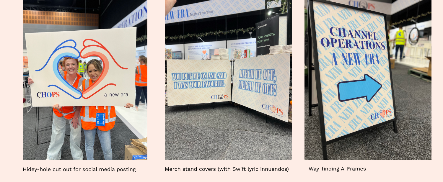
I supplied other collateral like a social-media cut-out for selfies, merch stand covers (with Taylor Swift lyric innuendos) and way-finding/signage:
Leaning further into leaving Swifty/Era’s Tour easter-eggs
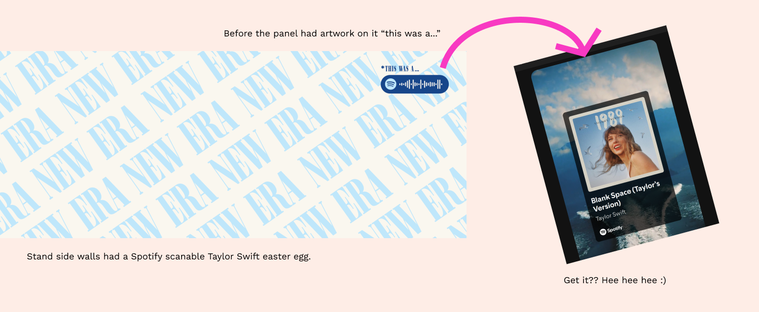
I had so much fun discovering ways to introduce more Taylor Swift easter-eggs (to keep aligning back to the initial Era’s Tour brief). I included a fun Swift-pun on the side panels of the booth, and some key Taylor dates in the booth ticket:
The outcome
The whole CHOPS team and leadership were thrilled with the end result and the cherry-on-top was the team winning “Most Engaging Stand” at Frontline 2024!
This brief and final artwork was totally different to any other Telstra team’s (and external partner’s) exhibition booth so we took a big swing being so different…
…and it certainly “paid-it off, paid-it off.” (Ok… that’s the end of the Swift-isms, promise).


