
The who
Telstra Design System - Able
Telstra is Australia’s largest Telecommunications company.
My role
Visual Designer
Tools
Illustrator
The request
In Telstra’s Design System - Able, there are over 150 pictogram illustrations that get used on the main Telstra website, and other internal and external sites and systems. Used to compliment content on the page to further help users understand the subject matter of the page.
When I joined Telstra there were inconsistencies in the pictograms, some were using previous branding colours, some were not telling a clear enough story and there was a need to add even more pictos to the library for teams to consume in their designs.
I took on the task of uplifting the large picto suite.

The uplift work
I collated all the pictos in the Able library into one Miro board and started the process of review with the VD Chapter Lead and the Illustration Guild members. Things we considered were:
Which pictos needed colour uplifting to align with new brand colours?
Which pictos needed slight tweaking? (ie, weren’t as strong as they could be to tell a clear story)
What were possible alternatives that could be proposed for pictos that needed to be replaced entirely.
Easier uplifts
Some pictos were easier to uplift with simple colour changes and minor tweaks:
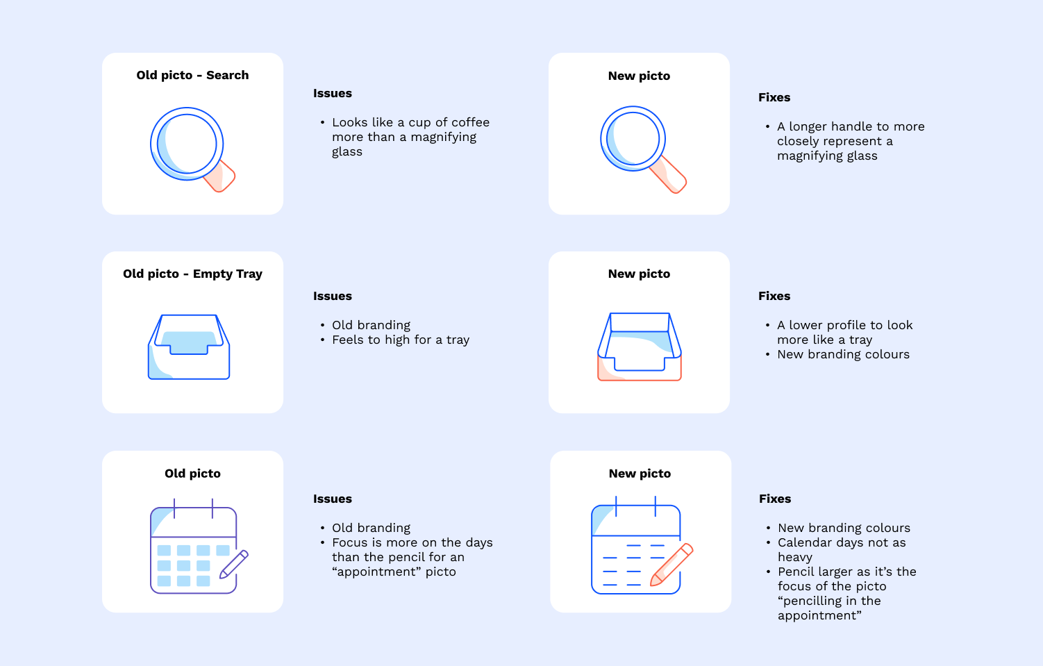
More challenging uplifts
Others required more exploration, critique and conversations before a final decision was made:
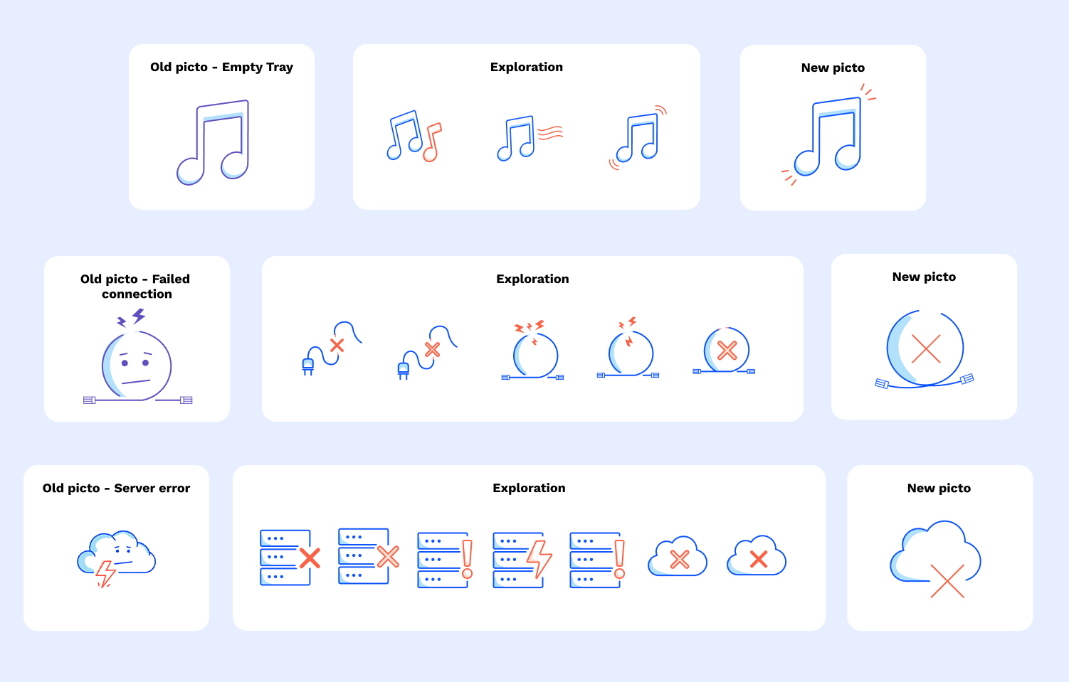
In fact, lotttttsssss of options were explored for the pictos that needed re-doing:
Creating new characters
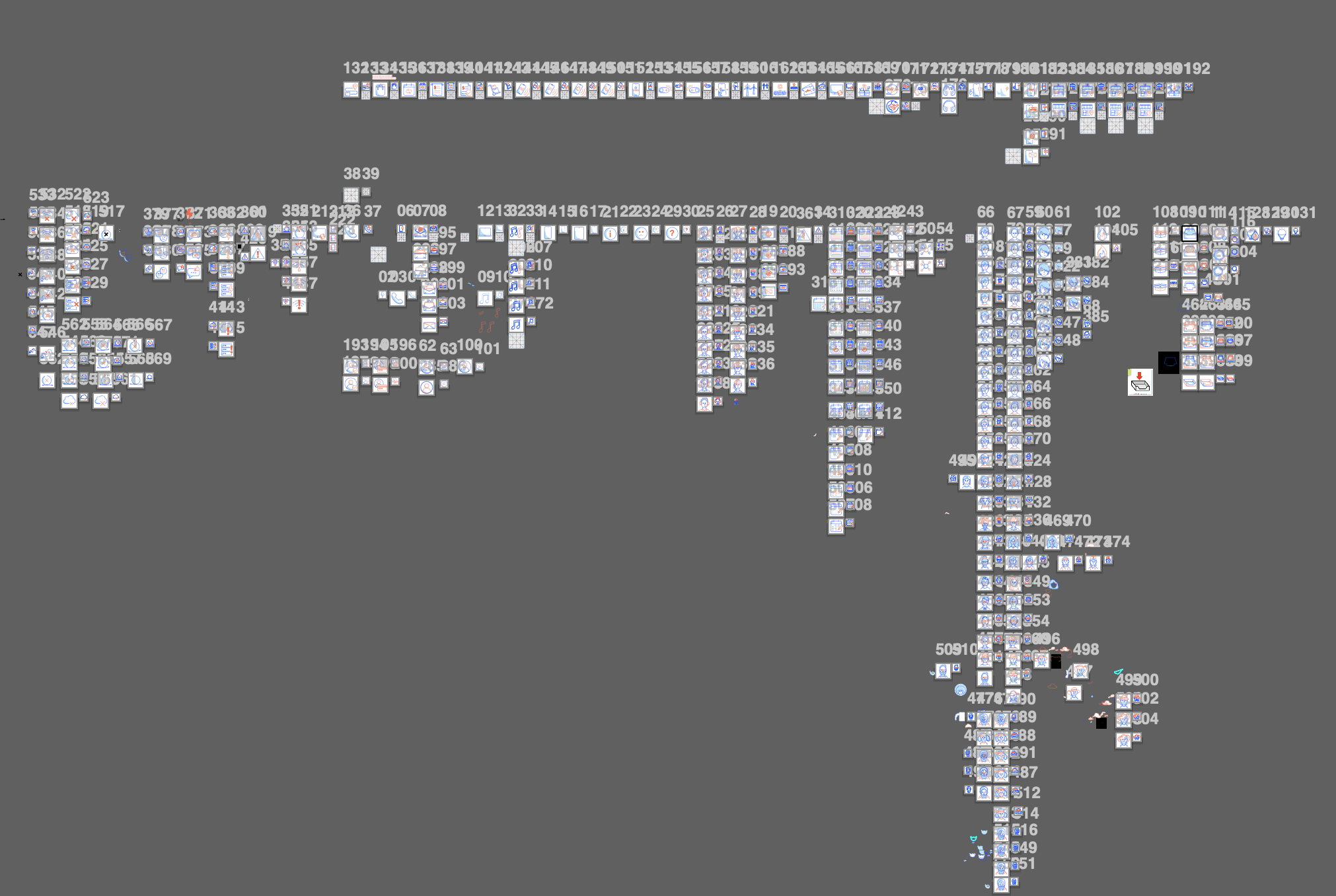
As a part of the picto uplift project new characters and avatars were created to better represent more gender and cultural diversity:

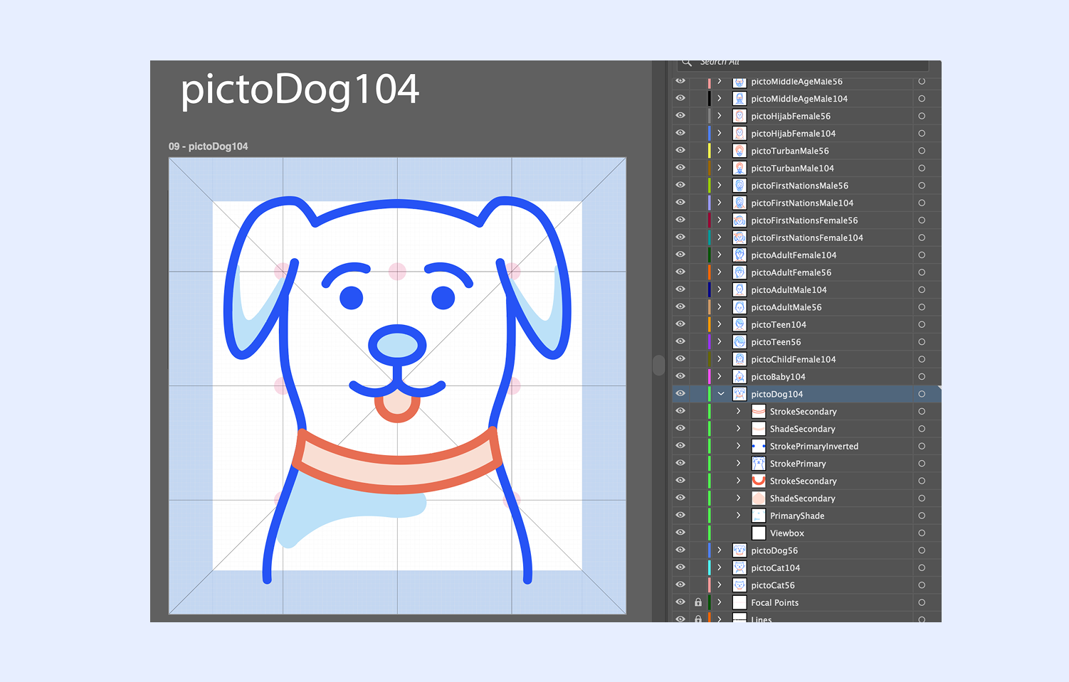
Using layers in illustrator
Each pictogram (remember there is well over 100 pictos undergoing an uplift) are made up of several layers:
Primary stroke (Blue)
Primary stroke inverted (Blue) - for solid colours, like circles or other block coloured items
Secondary stroke (Orange)
Secondary stroke inverted (Orange) - for solid colours, like circles or other block coloured items
Primary shade (Light blue)
Secondary shade (Light orange)
The reason for this is so that when the Design Team (Able) build the pictos into the Able library they are able to add strings to each layer, so that over time, as brand colours change etc, they can update the string code for each layer to change what they need rather than re-build again from scratch.
Yes… I hear you… that’s a lot of layers for a lot of pictos. By the end I probably looked like…

Continuing to create new pictos
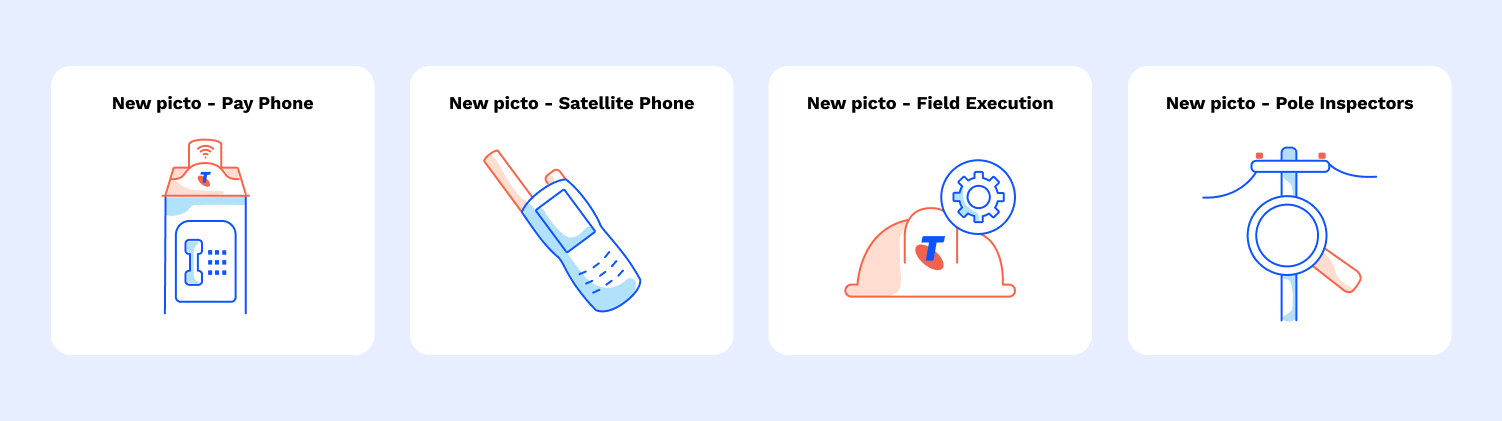
New picto requests come through to the design team quite often, and during my time at Telstra I also created various new pictos, for example:
The outcome
All the new and uplifted pictos were folded into the Able library for all of the Telstra design teams to consume. Across the board there is now more consistency, consideration and clearer story telling for the picto suite used across various Telstra platforms, sites and systems.