
The who
Shanghai BlueFlag Paper Technology Co., Ltd
A Shanghai-based company specialising in engineering technology for paper mills.
My role
Graphic Designer
Tools
Illustrator, InDesign
The problem
Shanghai BlueFlag Paper Technology Company are expanding to International countries outside of China. Their original logo and branding might be considered normal by Chinese design aesthetics, but by international aesthetics, it seems somewhat dated and rudimentary. The client wanted to create a more international-inclusive look and feel as they expand internationally.
The request
Update the company logo with a fresh modern look and feel. Create internationally inclusive marketing collateral to hand out at international trade shows.
Updating the logo
The original logo has strange spacing, a strange emphasis on the first letter (which doesn’t add any meaning) and uses a crunchy-looking typeface.

The updated logo introduces flag iconography for a bold, recognisable and more modern feel, but still offering individuality with the word “flag” inverse inside the blue flag.
The client requested an updated Chinese version also so that one incorporates the new modern look with additional traditional Chinese characters.

Business cards went from…

To… “let’s do business”…

The flag lines/angles from the logo carry through the branding with bold blue and white contrast for a fresh pop of branding and colour.
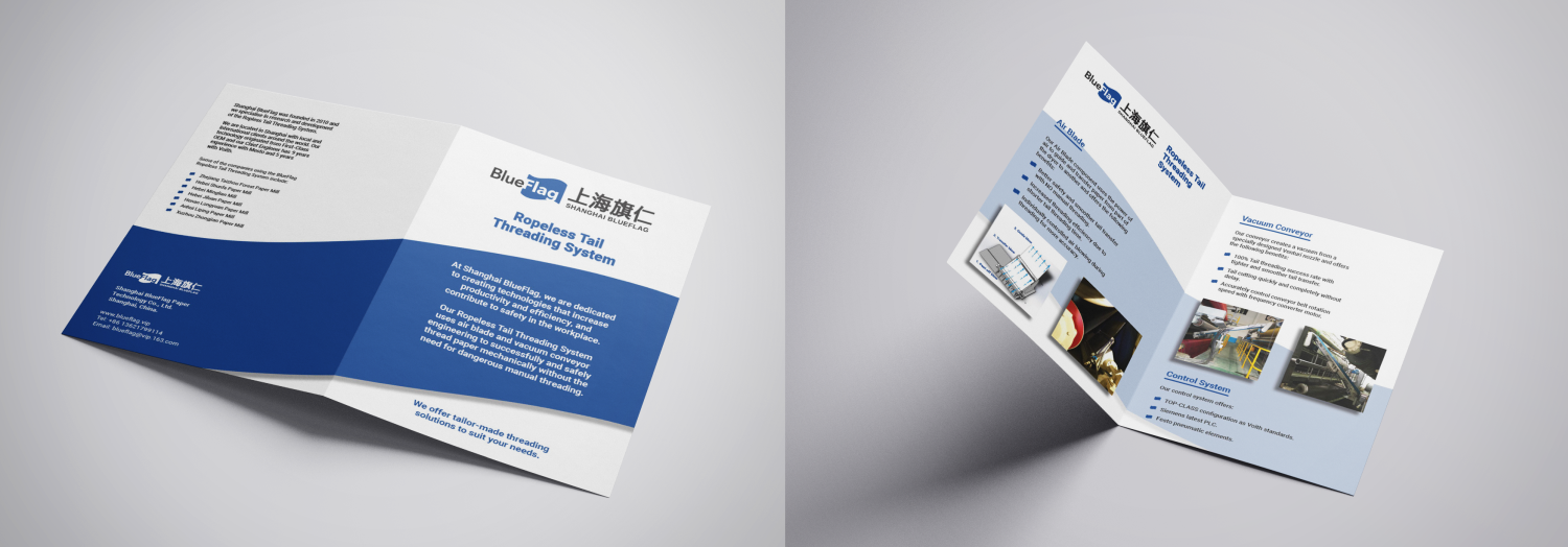
New marketing material
Updated marketing material gave the client confidence that the company would be taken seriously in the international market. It carries through the branding and colours from the logo and business cards.

The outcome
The new logo is used on the BlueFlag website and has influenced the overall branding direction of their website and other touchpoint collateral.
They fly their new logo flag with pride at local and International tradeshows.