

The who
Telstra.
Telstra is Australia’s largest Telecommunications company.
My role
UI Designer
Tools
Figma
Stakeholders
Project PO’s
Project Developers
Project UX/UI Designers
Accessibility SME’s
Please note:
When I started at Telstra we were using Sketch (for UI Design), Miro (for Design Critique boards) and Axure (for UX wires/prototyping). During my time, Telstra switched from Sketch and Axure to Figma, and from Miro to Atlassian Whiteboards. So, majority of the initial UX designs and my initial UI exploration designs were created in now decommissioned tools, hence, I have limited visual examples of early exploration iterations.
UI for ANC’s AI Assistant
The project I worked on at Telstra is called - Adaptive Networks Centre (ANC). It’s a brand new platform for Enterprise customers, partners and sellers to create their whole network of sites and services in one digital platform.
ANC introduced an AI Assistant chat page, using an LLM founded on Bedrock, so that users can not only ask questions about their network, eg “How many services do I have in Draft?”, but they can also have the AI do the grunt work for them, eg “Create 10 sites new sites with Adaptive Broadband.”
The process (and challenges)
I was provided initial UX wires, for example:
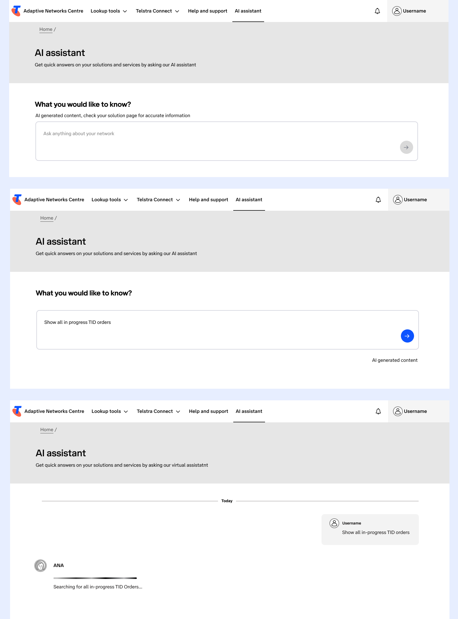
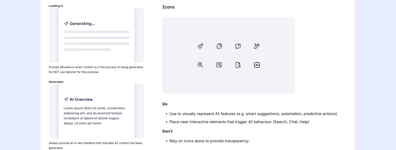
Because AI is relatively new to Telstra, the Design System Team - Able have started to create specific documentation and rules around how Telstra designs for AI interactions, eg:
using certain phrasing
using specific AI icons and pictograms
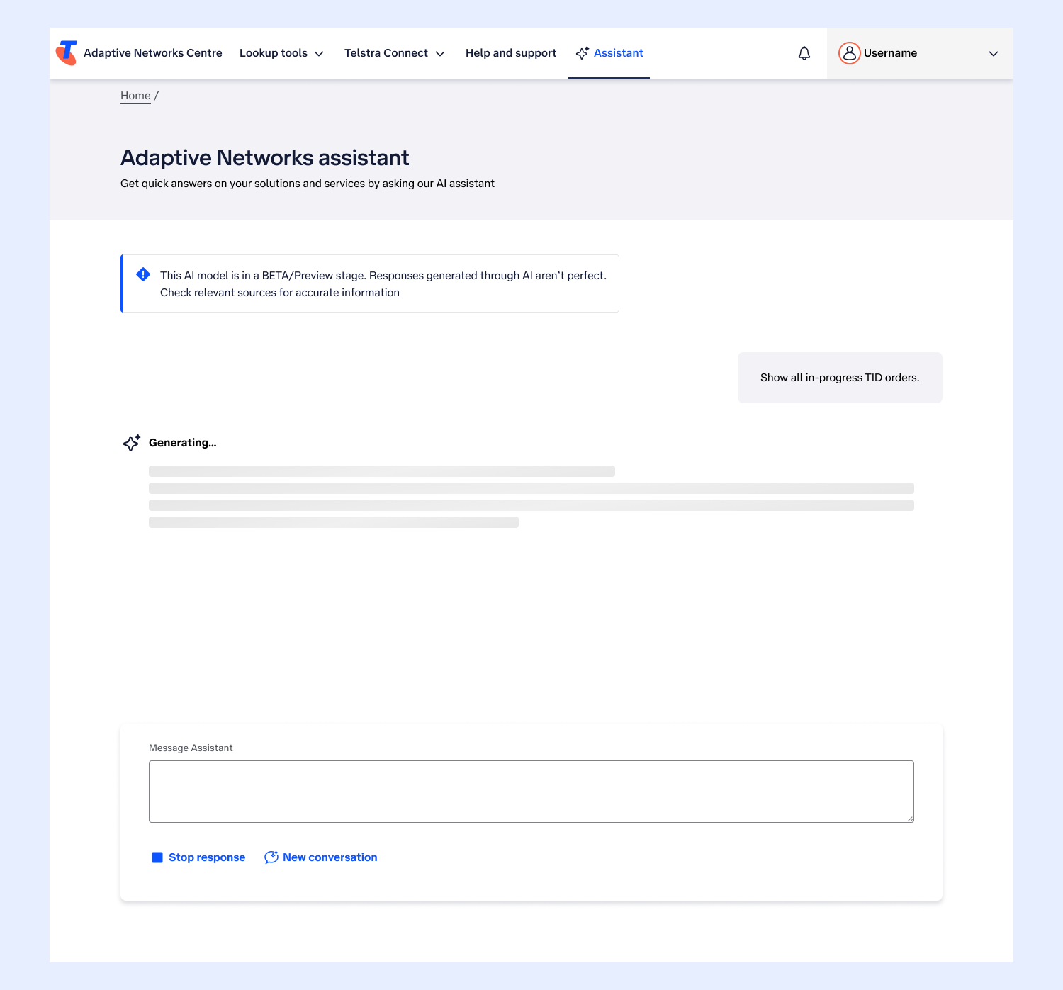
what the AI looks and sounds like while it’s generating a response etc.
During my UI exploration I made sure I was adhering to Able’s guidelines around designing for AI:
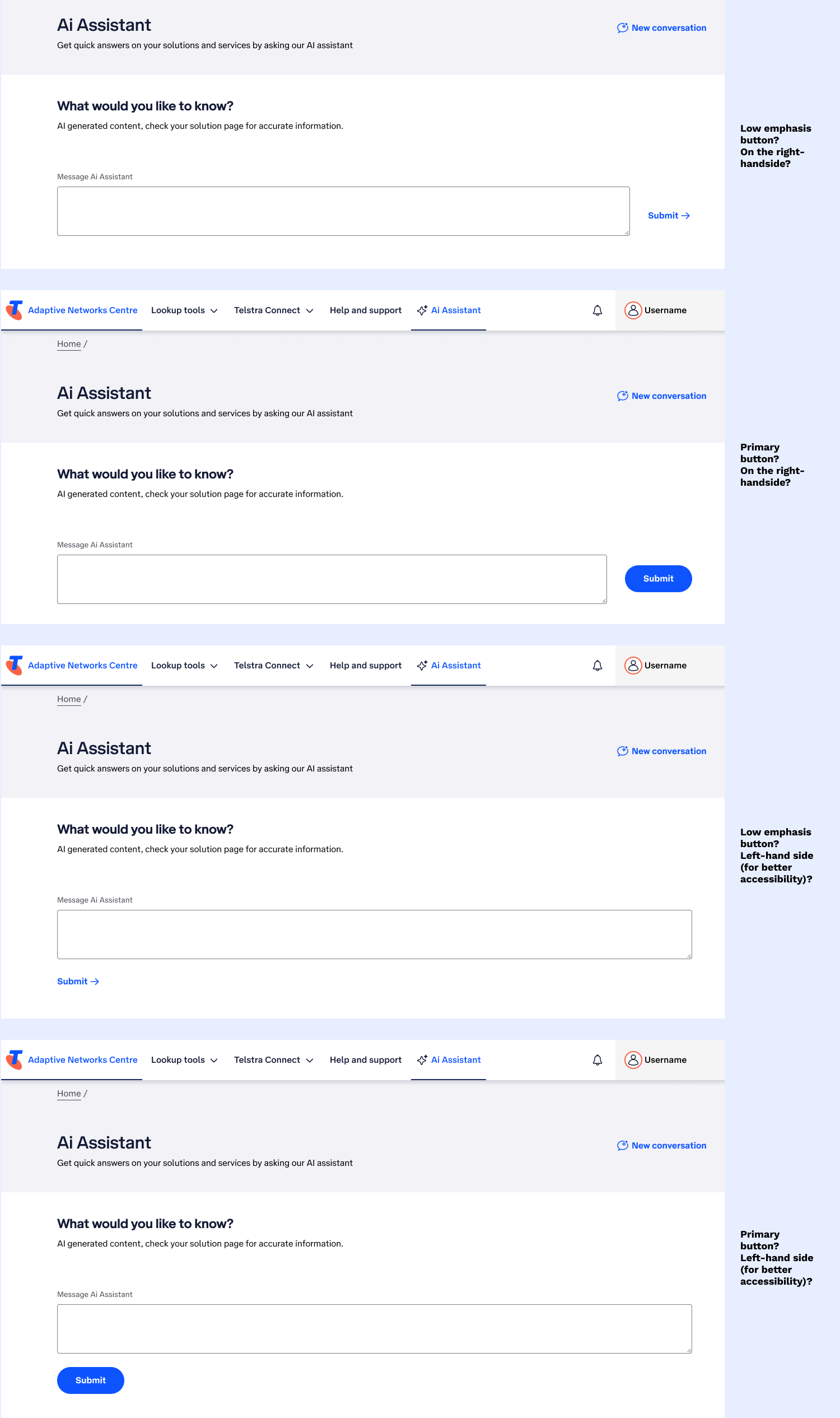
Because I am working with Design System components from Able and TEDUI to create the page, there aren’t yet standard AI components available in the library, such as, text boxes with round buttons inside them (like most AI chat pages have (CoPilot, ChatGPD, Claude etc)). For me to bring the AI Assistant to life, I had to consider what available Telstra components I had to re-create an experience that most AI users would be used to, but adhering to the design language available in the Design Systems.
The designs went through the natural cycle of Design Critiques with the project and wider Telstra Design community, along with consultation with Accessibility SMEs (eg, checking on button placement, on accessible button behaviour for when they appear and disappear based on the functionality available to the user in their interaction journey with the AI).
Some examples from my exploration work :
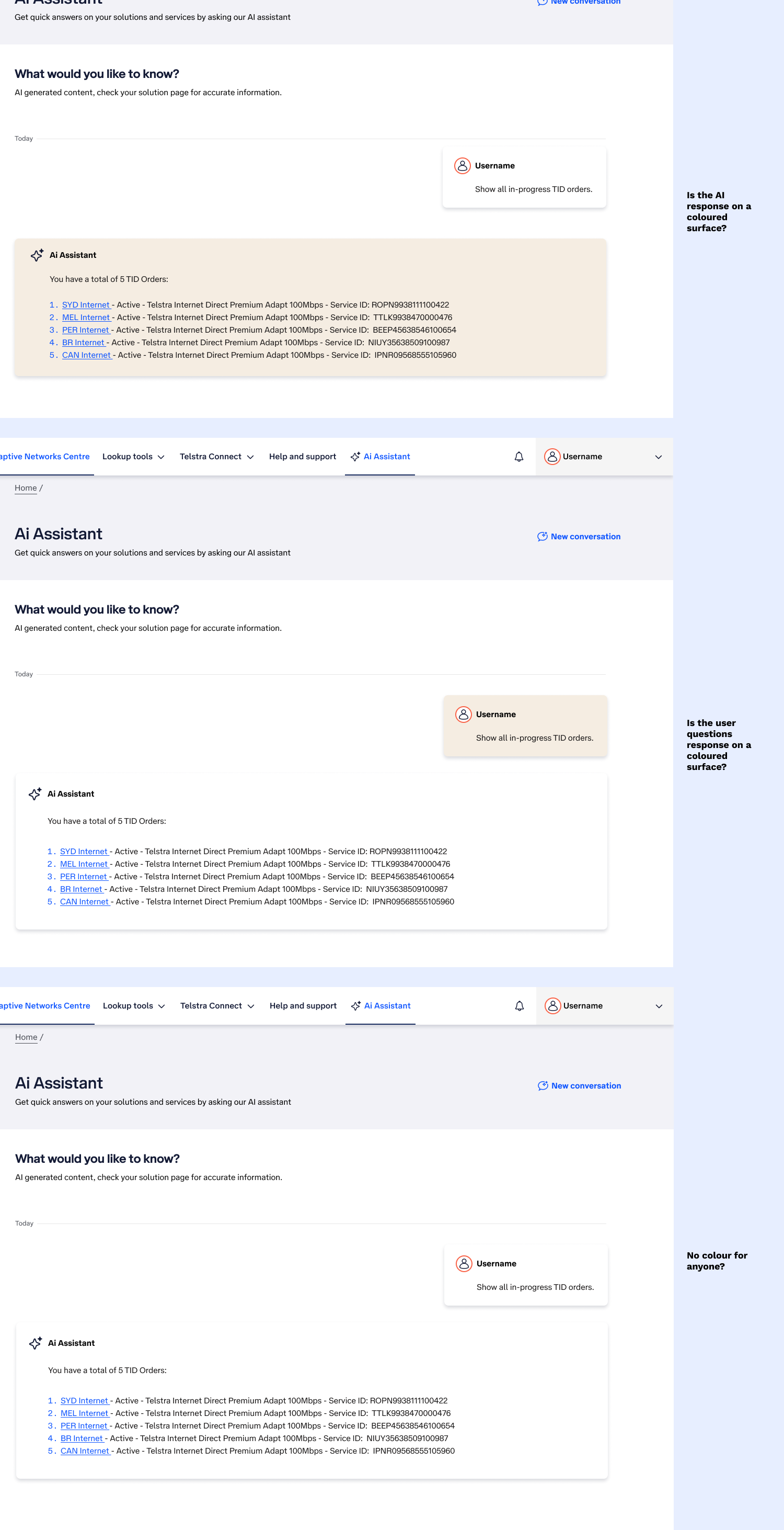
In my exploration, I also explored styling for the page for the users comment/question box and for the AI’s responses:
The outcome
The AI Assistant is in BETA phase and only released to a certain number of ANC users to stress-test the LLM, this also gives us a user base to seek feedback from in the future to make needed improvements to the page and the overall experience.
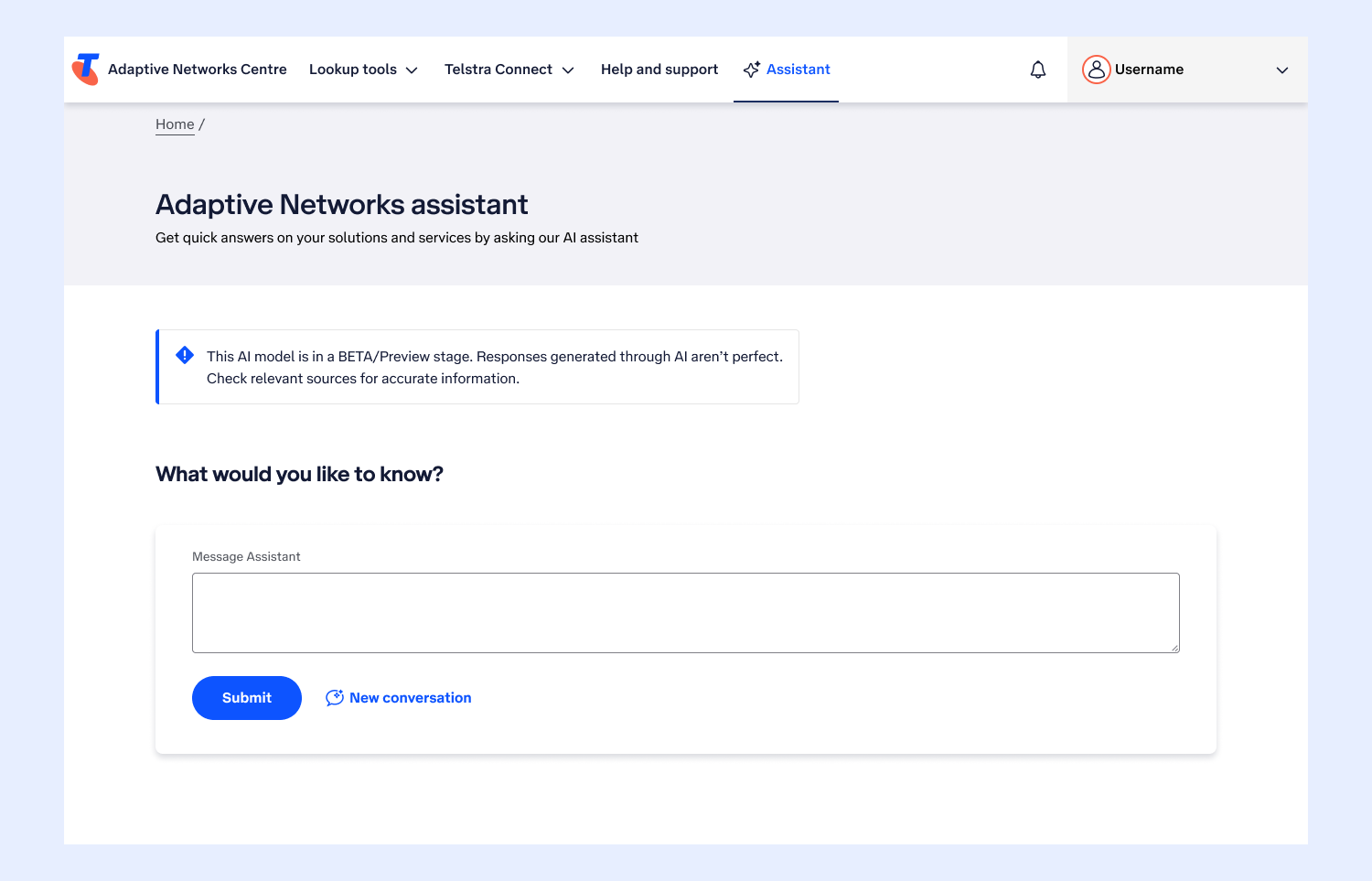
Here are some examples of the final page UI.
Default page load:
When the AI is generating a response:
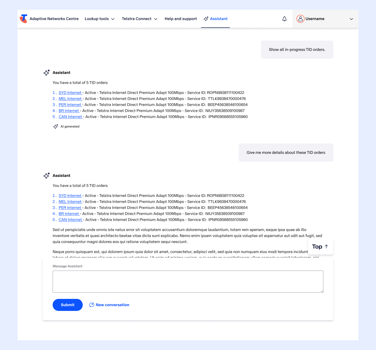
What it looks like when a longer conversation has taken place, considering the following:
Making sure the box to enter text is on a raised surface, for conversations to scroll behind it.
Introducing a “Back to top” floating button, so that users can get to the top of the page
UI for List view
ANC has a Canvas view that is essentially like a digital whiteboard, a blank space to add sites and move them around the canvas to visually set-up a network. The List view is a list version of the Canvas view, so all the information available on canvas view had to also be available on list view.
When I joined ANC there was a version of the List view proposed in UX wires, however, the UX design was not accessible and needed robust accessibility review and UI treatment before it could be built.
Uplifting the list view
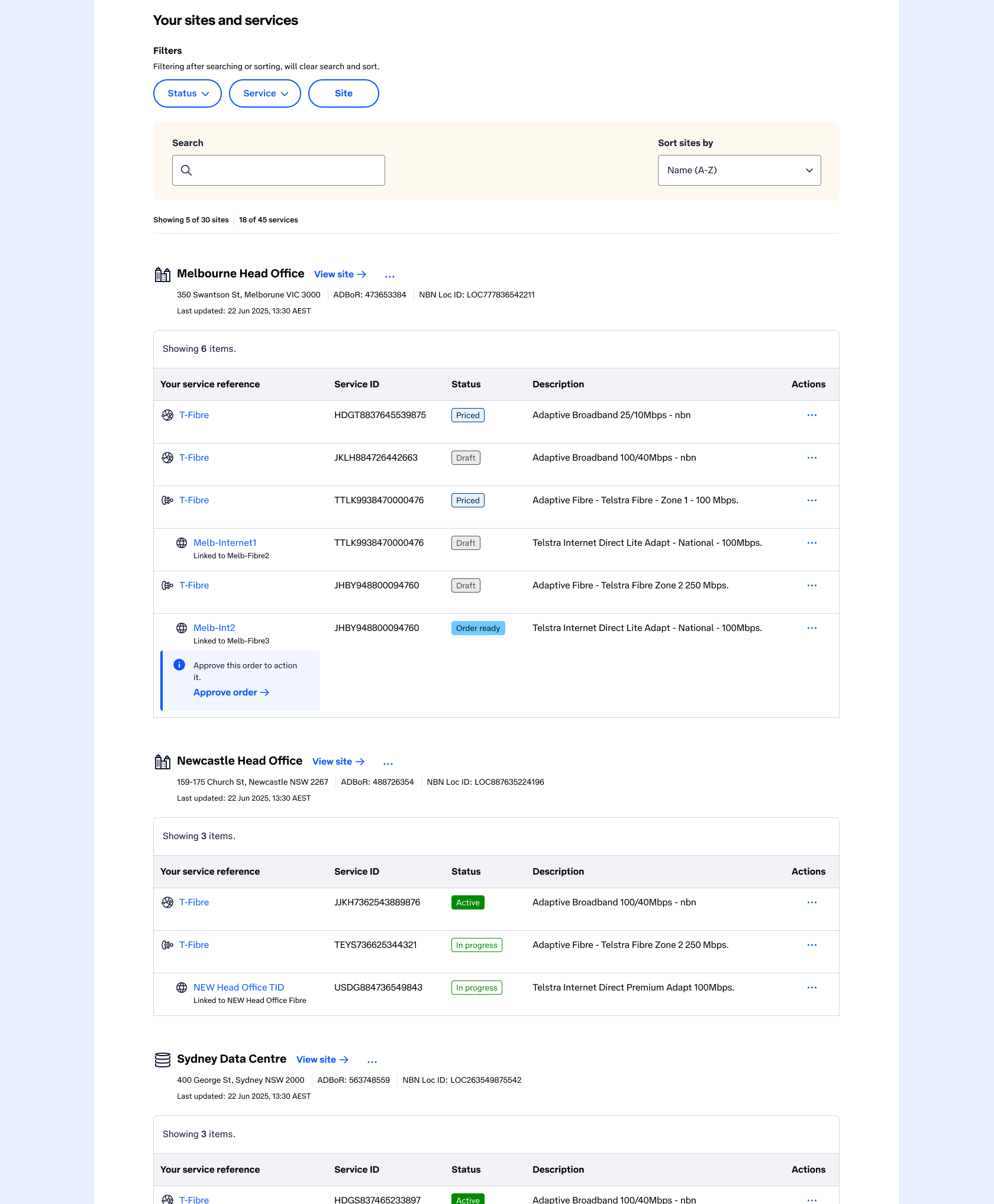
The UX wires for List view were presenting free-falling data without correct formatting. First things first, I needed to introduce tables to the page to structure all the data in a more tabulated way, this would ensure better accessibility (for keyboard and screen reader users), and make the data more digestible to every user, with clearer structure.
The project was very resistant to adding tables - “It doesn’t look like a list anymore” they told me. Once I advised them of the accessibility issues and how the general usability and comprehension of the page will greatly improved, they understood what needed to be done.
Improvements I made to uplift the original proposed UX for the List View:
Adding an H2 to the page “Your sites and services” so users know what they are looking at on the page.
A structured way to present filters, search and sort.
Advice from Accessibility SME’s to add “Showing” text (number of sites and services), so the user has a quick summary of what they’re actually looking at.
Adding tables to structure all the site data clearly.
Show what services would look like when they were “Linked” to another service (guided by Accessibility SME advice).
List view designs went through the natural cycle of Design Critiques with the project and wider Telstra Design community, along with consultation with Accessibility SMEs.
I even proposed a future uplift version (when the project is ready to pick it up) where the user may want to view their List by Site or by Service, so, when the user switches to “View by: Service” the tables display per service, with all the sites using that service.
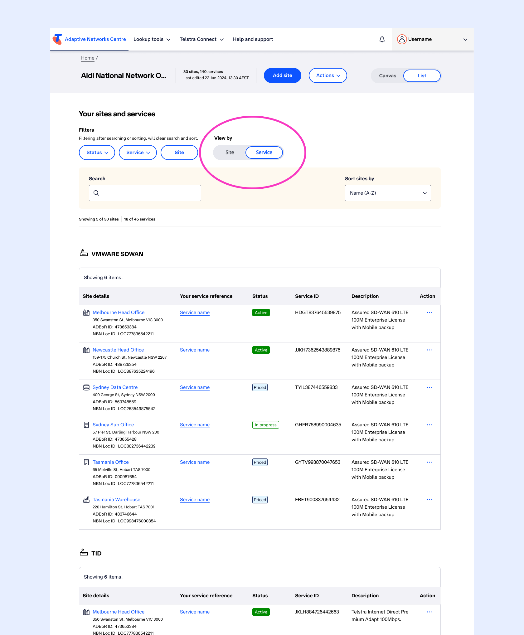
Creating a seamless experience between both Canvas and List views
The List view is a list version of the Canvas view, so all the information available on Canvas view had to also be available on List view. So I had to consider - How do we allow the user to seamlessly switch between the two views?
Considerations for the header banner included:
H1 Solution name was needed.
A summary of the number of sites and services to be visible.
A “Last edited” time stamp.
Various action to accomodate:
Add site
View pricing summary
Delete solution
A segmented switch “Canvas/List'“ to allow the user to seamlessly move from one view (Canvas) to another (the List version of the canvas).
The header banner can’t be too deep so that it doesn’t a) impede on available canvas space on Canvas view, and b) doesn’t push the content down the page too far in List view.
Various versions of exploration with different heights and configurations (placement of the elements) were explored and went through the natural cycle of Design Critiques with the project and wider Telstra Design community, along with consultation with Accessibility SMEs.
The final header was approved and implemented on both Canvas and List views:
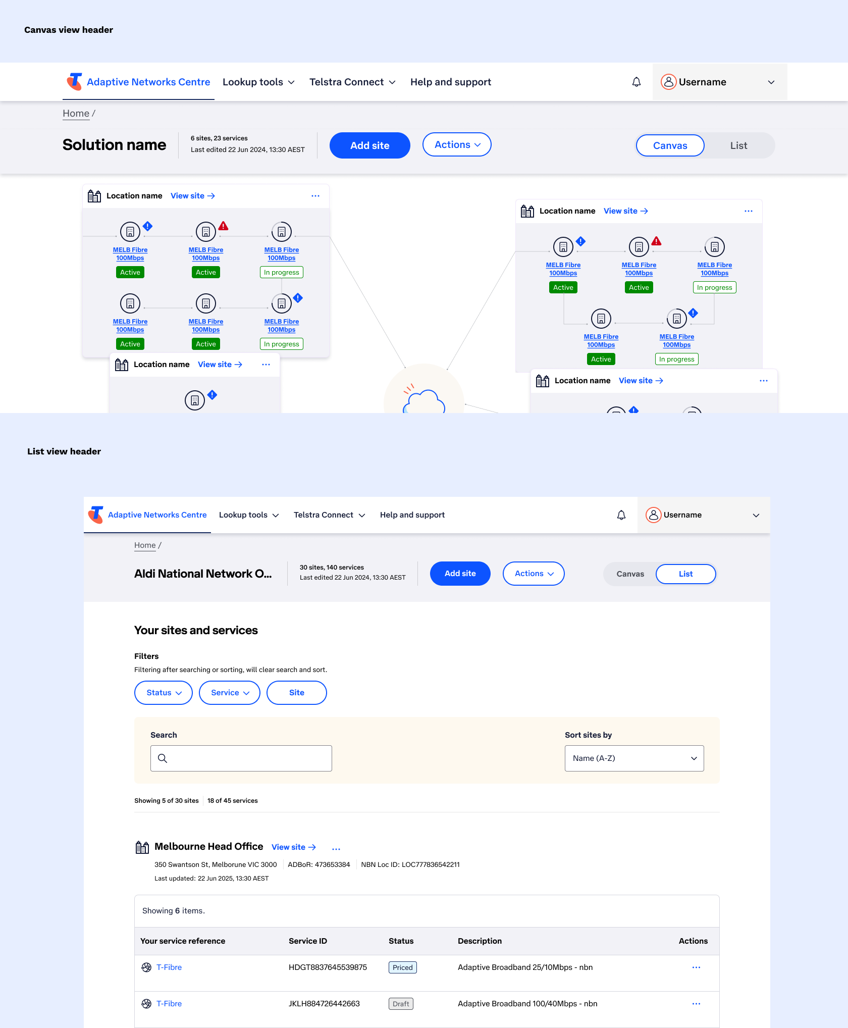
The outcome
Users now have access to a more comprehensible and accessible List view version of the Canvas view. So they can choose which format they would prefer to manage their network based on their individual needs.
Users can now effortlessly switch between the Canvas view and List view using the segmented switch inside a header that works across both views so the user feels like they’re in the same place, just looking at it in different formats.
Pricing Summary page uplift
I was asked to uplift the original UI for the Pricing Summary page:
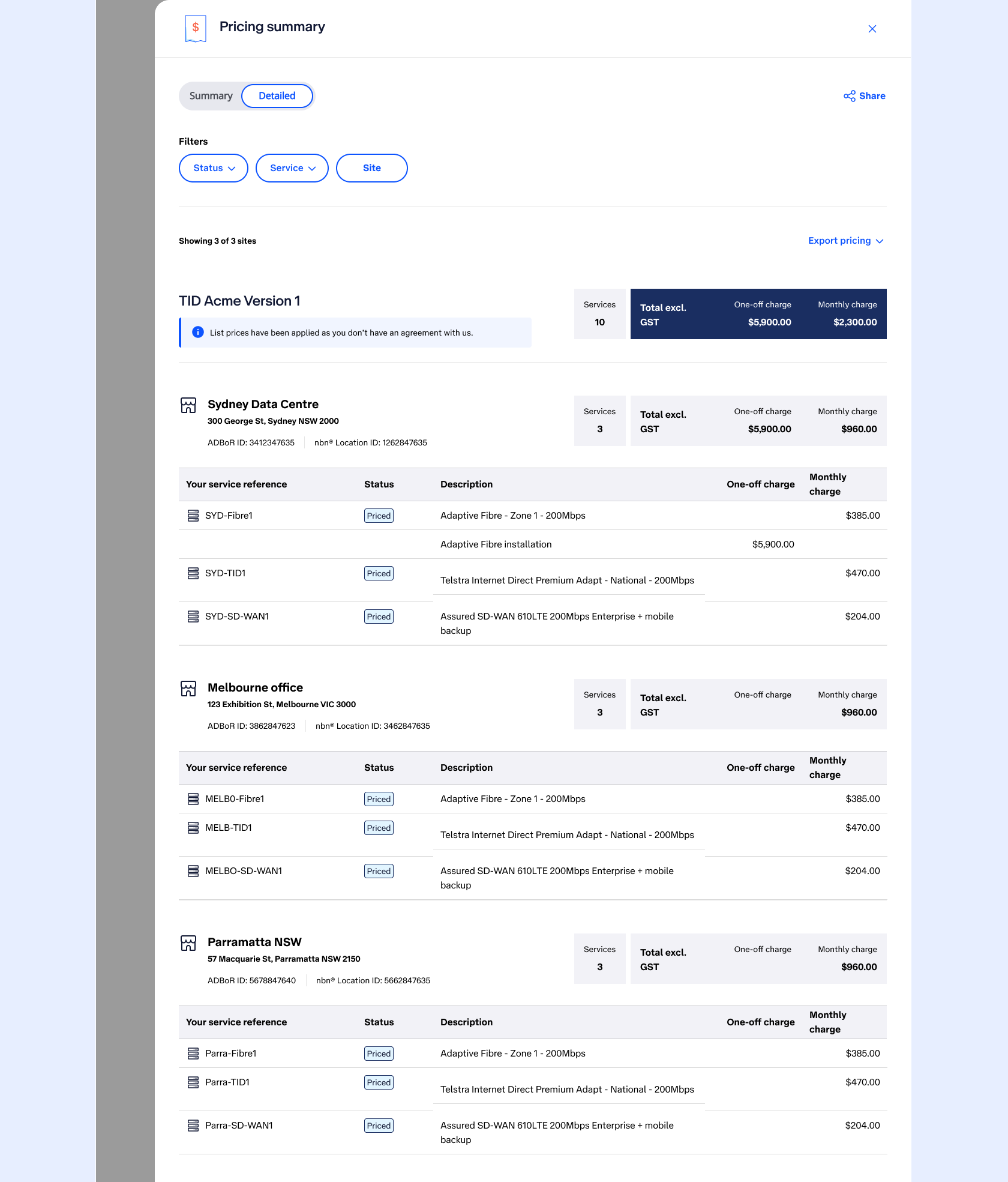
The new requirements and challenges:
Relabel the Summary/Detailed segmented switch to Standard/Advanced and only available to Sellers and Partners.
Users need the ability to select which pricing agreement they want to see on the page.
With that, came the need for the user to have the ability to refresh the agreement (as the system cache for updating agreements was 24 hours, so if it didn’t manually upate the user needed to manually update and see a time stamp of last updated so they could make informed decisions.
The ability to sort the sites.
The ability to show and hide one-off charges.
Design exploration went through many options:
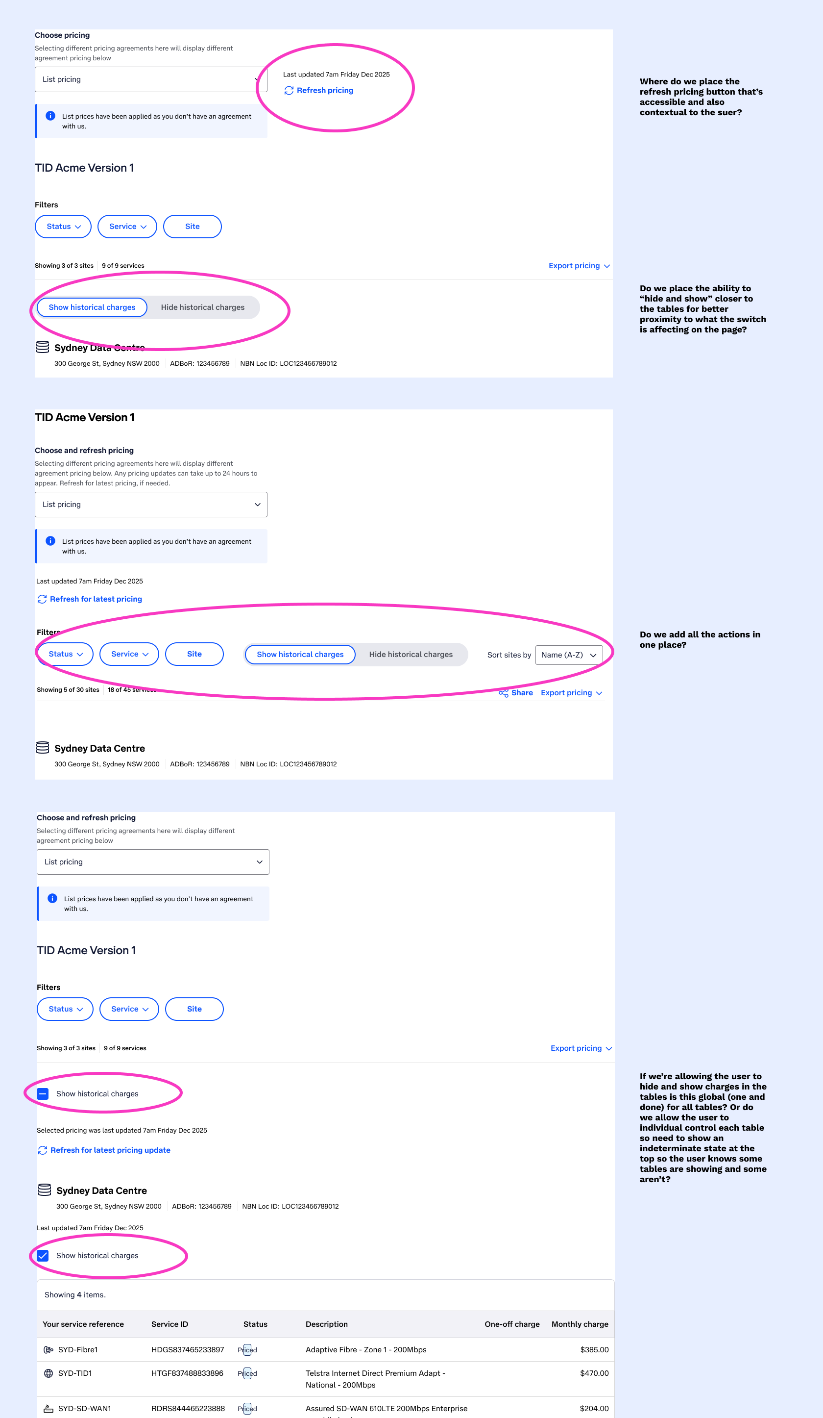
Utilising existing components for consistency
Because I worked on the List view I knew we already had a component for the filters which included a sand bar for search and sort.
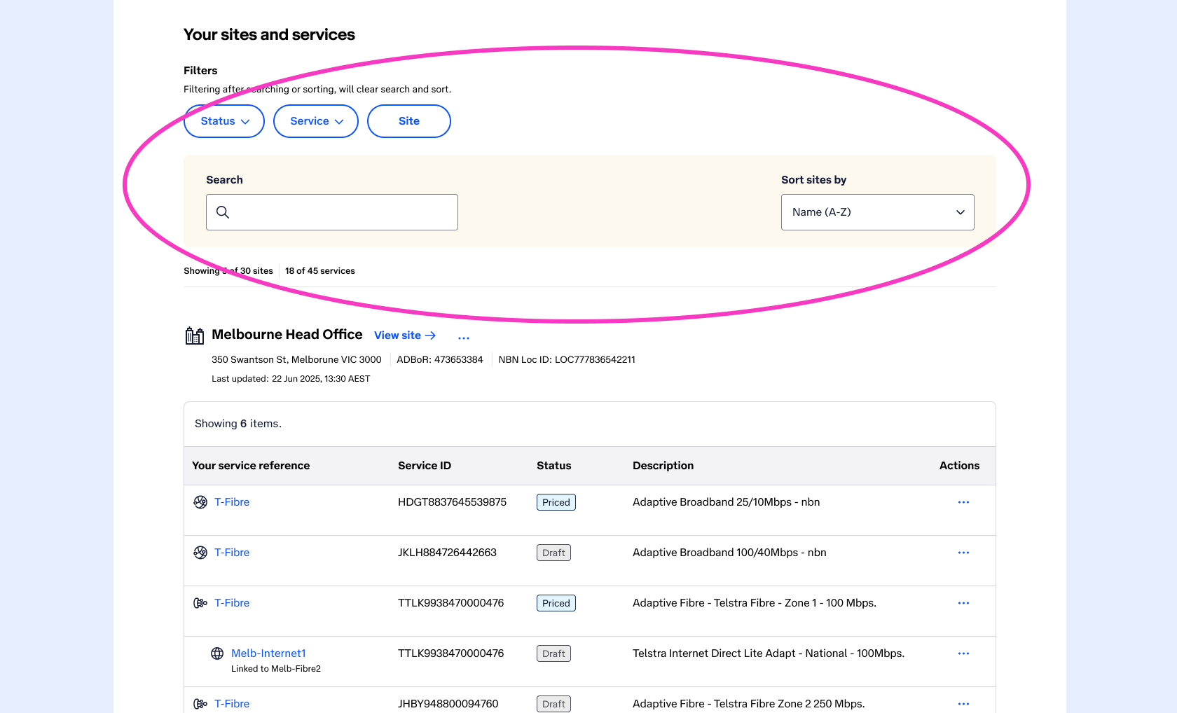
I advised the project that because we were introducing Sort into the Pricing Summary page and we already had the existing component for Filters/Search/Sort (from List view) that we should introduce it to this page, for visual and functional consistency across the portal.
The outcome
The designs went through the natural cycle of Design Critiques with the project and wider Telstra Design community, along with consultation with Accessibility SMEs. Here are the final UI changes and decisions:
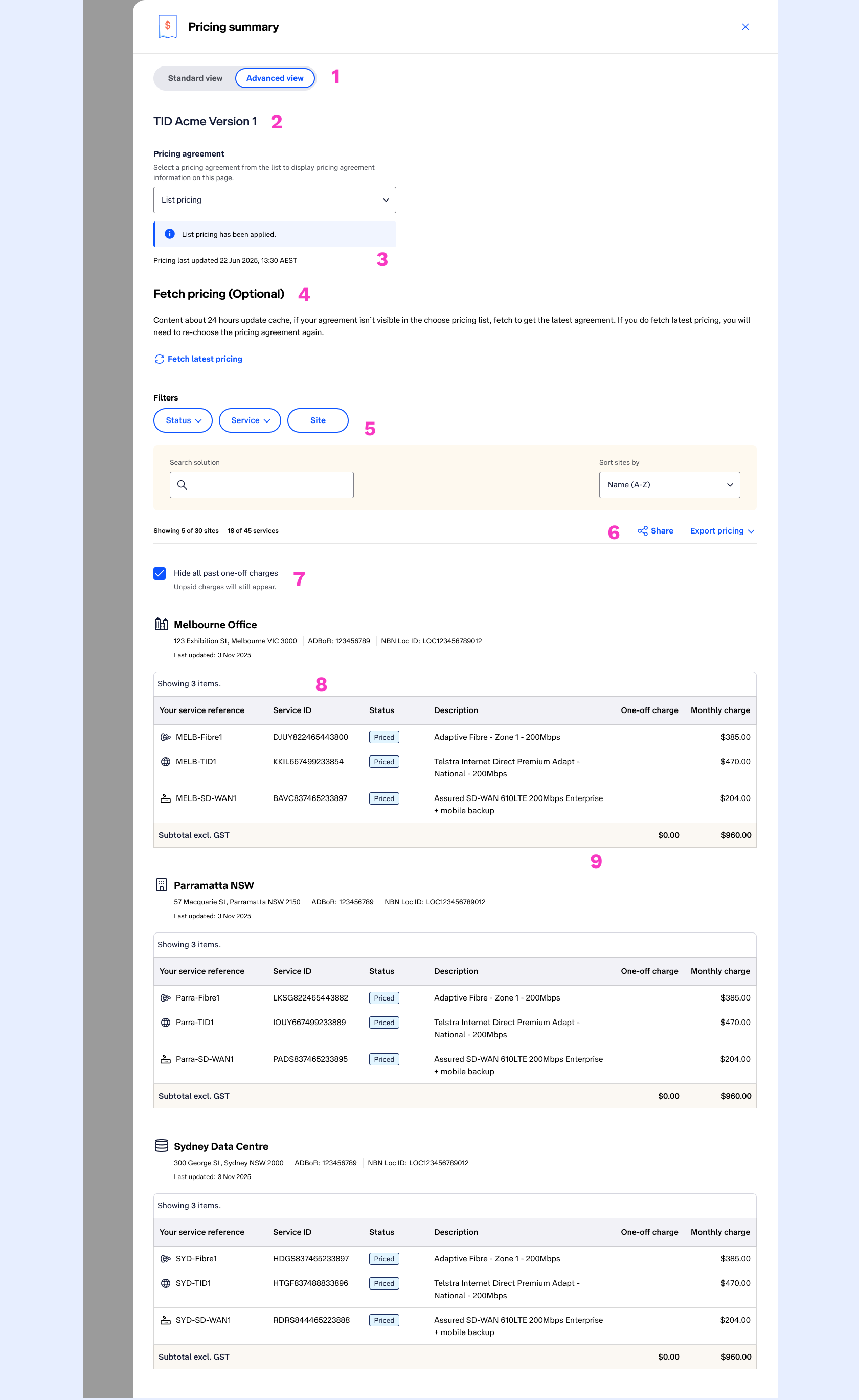
Switch component content updated and only visible to Sellers and Partners.
An H2 added (to let users know which network the pricing was for).
A drop-down added for users to select which pricing agreement they wanted to view.
A time-stamp added to inform users of the last updated time.
New content and button explaining to users they can refresh the pricing agreement if the time stamp was too old (so they could see the latest pricing).
Adding the same filter/search/sort component from List view
Aligning the “Showing” text the same as list view for consistency and bringing the Share button down next to Export so that all action buttons were in one place.
With advise from Accessibility SME’s I went with a checkbox closer to the tables which allowed users to hide and show one-off charges. The project had no appetite for allowing hide and show in individual tables.
Table styling and column order amended to suit other tables elsewhere in ANC for consistency.